FreeViz
Displays FreeViz projection.
Inputs
- Data: input dataset
- Data Subset: subset of instances
Outputs
- Selected Data: instances selected from the plot
- Data: data with an additional column showing whether a point is selected
- Components: FreeViz vectors
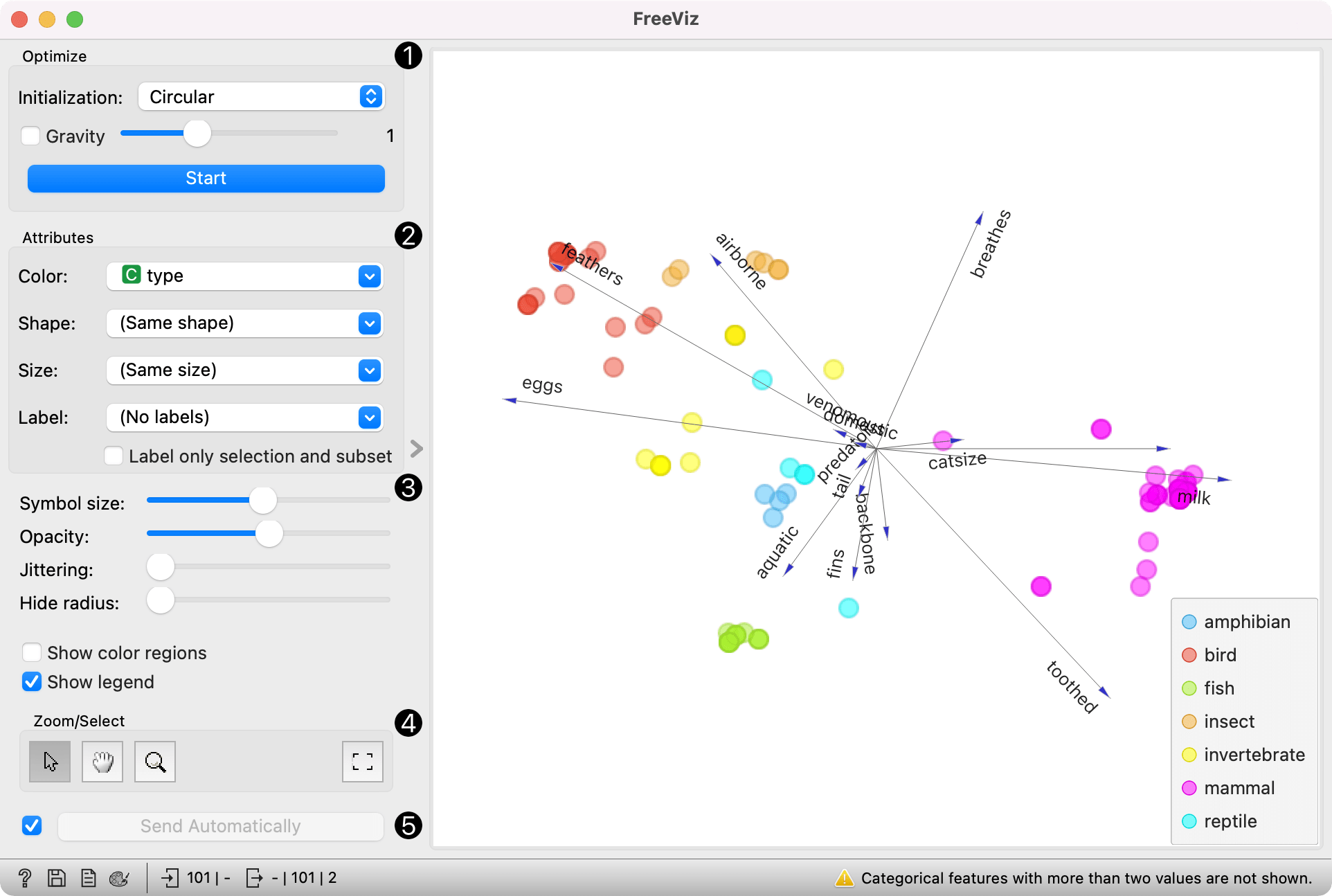
FreeViz uses a paradigm borrowed from particle physics: points in the same class attract each other, those from different class repel each other, and the resulting forces are exerted on the anchors of the attributes, that is, on unit vectors of each of the dimensional axis. The points cannot move (are projected in the projection space), but the attribute anchors can, so the optimization process is a hill-climbing optimization where at the end the anchors are placed such that forces are in equilibrium. The button Optimize is used to invoke the optimization process. The result of the optimization may depend on the initial placement of the anchors, which can be set in a circle, arbitrary or even manually. The later also works at any stage of optimization, and we recommend to play with this option in order to understand how a change of one anchor affects the positions of the data points. In any linear projection, projections of unit vector that are very short compared to the others indicate that their associated attribute is not very informative for particular classification task. Those vectors, that is, their corresponding anchors, may be hidden from the visualization using Radius slider in Show anchors box.
-
Two initial positions of anchors are possible: random and circular. Optimization moves anchors in an optimal position. If checked, Gravity adjusts the tendency of same-colored points to cluster together. Press Start to run the optimization.
-
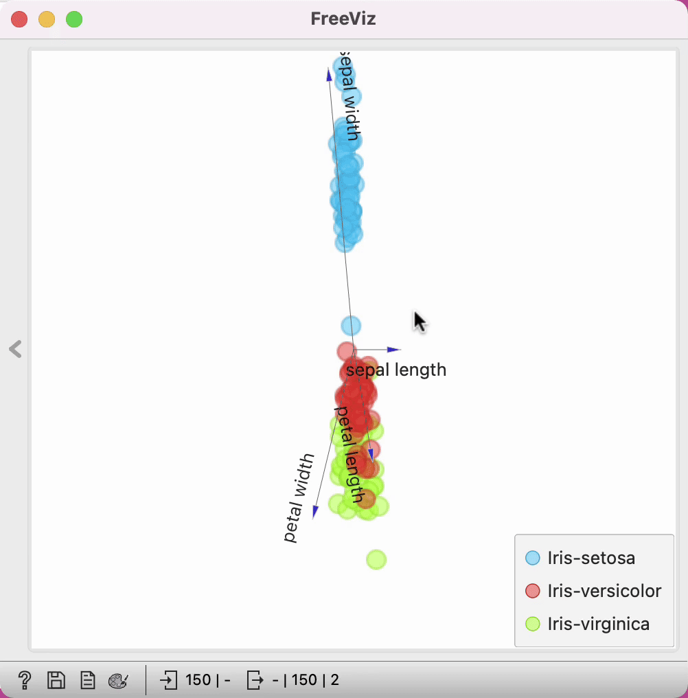
Set the color of the displayed points (you will get colors for discrete values and BGY gradient points for continuous). Set label, shape and size to differentiate between points. Label only selection and subset allows you to select individual data instances and label them.
-
Adjust plot properties:
- Symbol size changes the size of the points.
- Opacity changes the transparency of the points.
- Set jittering to prevent the dots from overlapping (especially for discrete attributes).
- Anchors inside a circle are hidden. Circle radius can be changed using Hide radius.
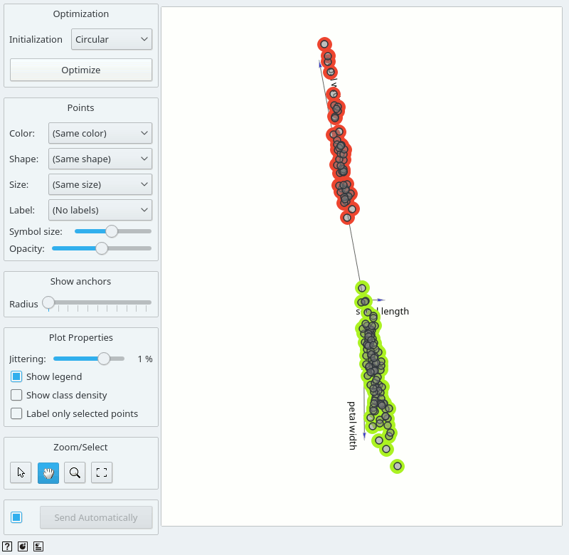
- Show color regions colors the graph by the Color attribute (see the screenshot below).
- Show legend displays a legend on the right. Click and drag the legend to move it.
-
Select, zoom, pan and zoom to fit are the options for exploring the graph. The manual selection of data instances works as an angular/square selection tool. Scroll in or out for zoom.
-
If Send automatically is ticked, changes are communicated automatically. Alternatively, press Send.
Manually move anchors
One can manually move anchors. Use a mouse pointer and hover above the end of an anchor. Click the left button and then you can move selected anchor where ever you want.
Selection
Selection can be used to manually define the subgroups in the data. The default tool is Select, which selects data instances within the chosen rectangular area. Use Shift modifier when selecting data instances to put them into a new group. Shift + Ctrl (or Shift + Cmd on macOs) appends instances to the last group. Alt removes the chosen instance from the group.
Pan enables you to move the plot around the pane. With Zoom you can zoom in and out of the pane with a mouse scroll, while Reset zoom resets the visualization to its optimal size.
The widget outputs a data table with an additional column that contains group indices.
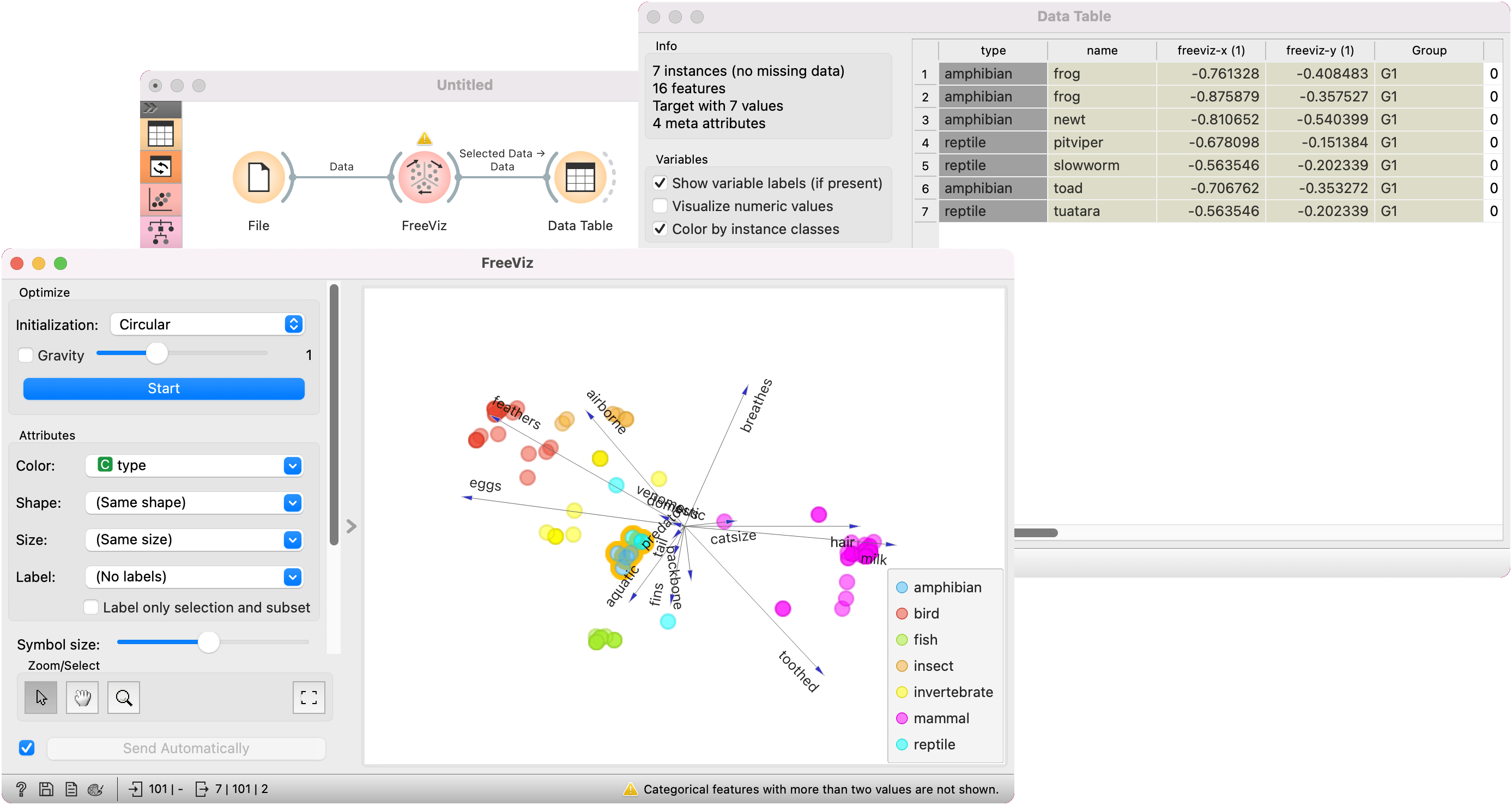
Example
An example of a simple schema, where we observe a projection of the zoo dataset. We optimized the plot to place similar points together. Thus we can observe that mammals are distinctly different from other animals.
There is an area of the plot that places reptiles and amphibians close together. We have selected the points by dragging a rectangle over them. Next, we can observe the selected instances in a Data Table. It looks like frogs and worms share some characteristics. What could these be? Use Data Table to find out.