t-SNE
Two-dimensional data projection with t-SNE.
Inputs
- Data: input dataset
- Distances: distance matrix
- Data Subset: subset of instances
Outputs
- Selected Data: instances selected from the plot
- Data: data with t-SNE coordinates and an additional column showing whether a point is selected
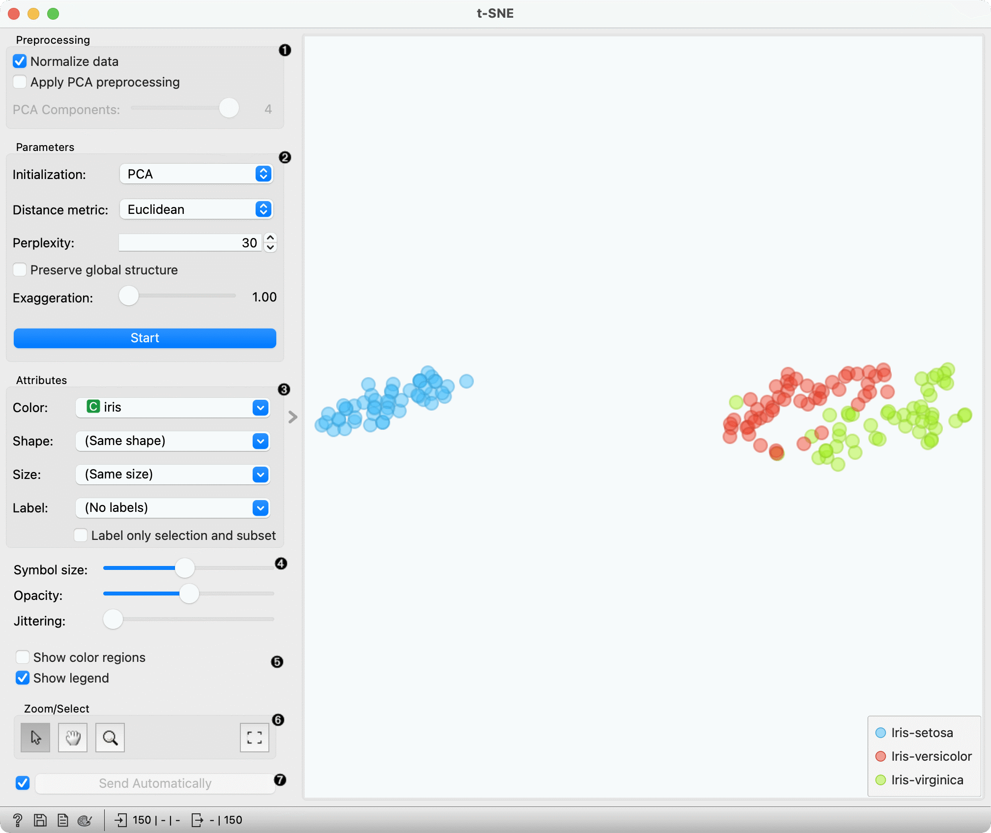
The t-SNE widget creates a visualization using t-distributed stochastic neighbor embedding (t-SNE). t-SNE is a dimensionality reduction technique, similar to MDS, where points are mapped to 2-D space by their probability distribution.
The widget accepts either a data table or a distance matrix as input. If a data table is provided, the widget will apply the chosen preprocessing option, then calculate distances internally.
-
Preprocessing is applied before t-SNE computes the distances between data points in the dataset. These parameters are ignored when the Distances input is provided.
- Normalize data: We can apply standardization before running PCA. Standardization normalizes each column by subtracting the column mean and dividing by the standard deviation.
- Apply PCA preprocessing: For datasets with large numbers of features, e.g. 100 or 1,000, or highly correlated variables, we can apply PCA preprocessing to speed up the algorithm and decorrelate the data.
- PCA components: the number of principal components to use when applying PCA preprocessing.
-
Optimization parameters. The parameters are explained in-depth here:
- Initialization: PCA positions the initial points along principal coordinate axes. Spectral inialization calculates the spectral embedding of t-SNE's affinity matrix. Only spectral intialization is supported when using precomputed distance matrices.
- Distance metric: The distance metric to be used when calculating distances between data points. This setting is ignored when a precomputed distance matrix is provided.
- Perplexity: Roughly speaking, perplexity be interpreted as the number of nearest neighbors to which distances will be preserved. Using smaller values can reveal small, local clusters, while using large values tends to reveal the broader, global relationships between data points.
- Preserve global structure: this option will combine two different perplexity values (50 and 500) to try preserve both the local and global structure.
- Exaggeration: this parameter increases the attractive forces between points, and can directly be used to control the compactness of clusters. Increasing exaggeration may also better highlight the global structure of the data. t-SNE with exaggeration set to 4 is roughly equal to UMAP.
- Press Start to (re-)run the optimization.
-
Set the color of the displayed points. Set shape, size and label to differentiate between points. If Label only selection and subset is ticked, only selected and/or highlighted points will be labelled.
-
Set symbol size and opacity for all data points. Set jittering to randomly disperse data points.
-
Show color regions colors the graph by class, while Show legend displays a legend on the right. Click and drag the legend to move it.
-
Select, zoom, pan and zoom to fit are the options for exploring the graph. The manual selection of data instances works as an angular/square selection tool. Double click to move the projection. Scroll in or out for zoom.
-
If Send selected automatically is ticked, changes are communicated automatically. Alternatively, press Send Selected.
Preprocessing
If necessary, t-SNE applies the following preprocessing steps by default, in the following order:
- continuizes categorical variables (with one feature per value)
- imputes missing values with mean values
To override default preprocessing, preprocess the data beforehand with Preprocess widget.
The "Preprocessing" section also contains user-controllable options that are applied to a data table before distances are computed.
If a distance matrix is provided as input, preprocessing is not applied.
Examples
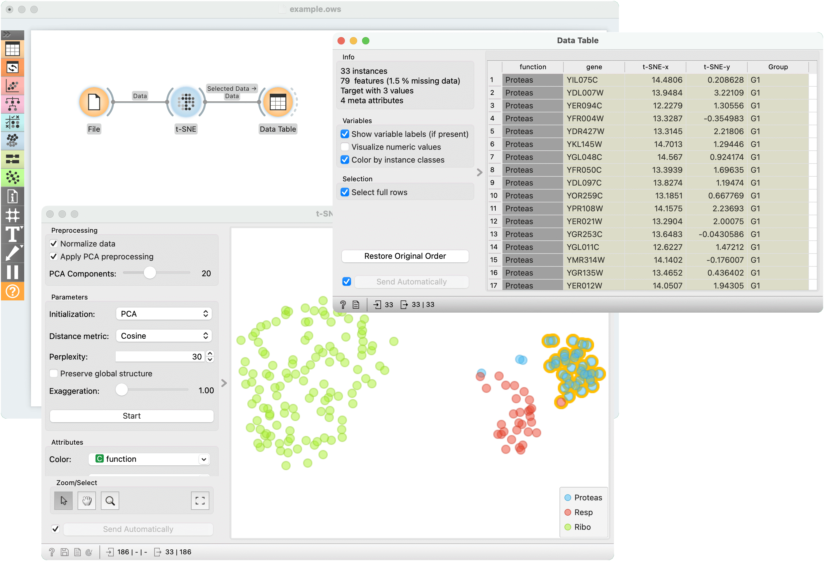
The first example is a simple t-SNE plot of brown-selected data set. Load brown-selected with the File widget. Then connect t-SNE to it. The widget will show a 2D map of yeast samples, where samples with similar gene expression profiles will be close together. Select the region, where the gene function is mixed and inspect it in a Data Table.
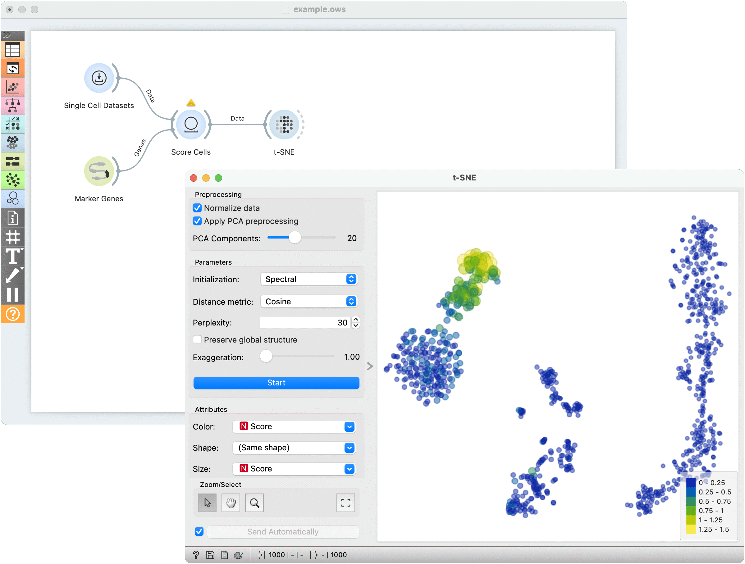
For the second example, use Single Cell Datasets widget from the Single Cell add-on to load Bone marrow mononuclear cells with AML (sample) data. We can use t-SNE to visualize the dataset. The t-SNE visualization shows that there indeed appear to be clusters of cells in our dataset.
Let's try to determine which cluster of cells corresponds to natural killer cells (NK cells). The Marker Genes widget from the Single Cell add-on contains collections of known marker genes for different cell types. Select the markers for NK cells.
We can then score how much each of our cells corresponds to these marker genes using the Score Cells widget. We can then visualize the result in our t-SNE plot. We color the points and determine their size according to the computed Score. The brightly-colored, larger points correspond to cells that had high expression values of our marker genes. We can conclude that this, upper-left cluster of cells corresponds to NK cells.