Volcano Plot
Plots significance versus fold-change for gene expression rates.
Inputs
- Data: Input data set.
Outputs
- Selected Data: Data subset.
Volcano plot is a graphical method for visualizing changes in replicate data. The widget plots a binary logarithm of fold-change on the x-axis versus statistical significance (negative base 10 logarithm of p-value) on the y-axis.
Volcano Plot is useful for a quick visual identification of statistically significant data (genes). Genes that are highly dysregulated are farther to the left and right, while highly significant fold changes appear higher on the plot. A combination of the two are those genes that are statistically significant.
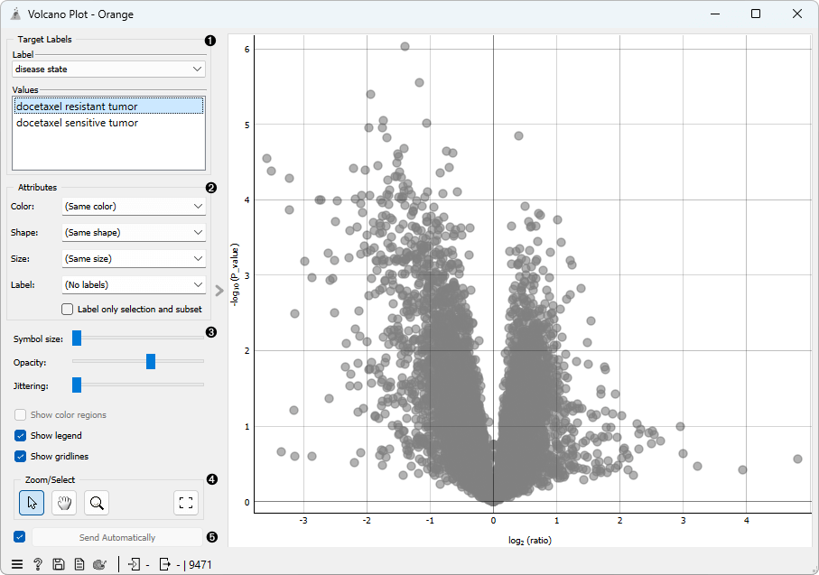
- Select the target label in Target labels. Labels depend on the attributes in the input. In Values change the sample target (default value is the first value on the list, alphabetically or numerically).
- In Attributes set the color of the displayed points. Set shape, size and label to differentiate between points. If Label only selection and subset is ticked, only selected and/or highlighted points will be labelled.
- Set symbol size and opacity for all data points. Set jittering to randomly disperse data points.
- Select, zoom, pan and zoom to fit are the options for exploring the graph. The manual selection of data instances works as an angular/square selection tool. Scroll in or out for zoom.
- If Send automatically is ticked, changes are communicated automatically. Alternatively, press Send selection.
Example
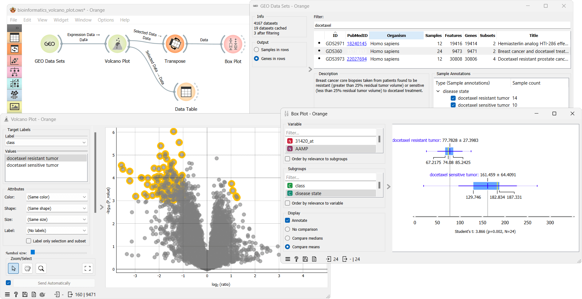
From the GEO Data Sets widget, we select Breast cancer and docetaxel treatment (GDS360) with 14 treatment resistant and 10 treatment sensitive tumors. We select Genes in rows as output. Then we use the Volcano plot widget to select the most interesting genes. We observe the selected data subset in a Data Table. The table shows selected genes with the additional log2 (ratio) and -log10 (P_value) columns. To visualize the difference in expression of each selected gene, we first transpose the data using Transpose widget and then use the Box Plot widget. This workflow can be accessed here.