Annotator
The widget provides an option to annotate cells with cell types based on marker genes.
Inputs
- Reference Data: Data set with gene expression values.
- Secondary Data: Subset of instances (optional).
- Genes: Marker genes.
Outputs
- Selected Data: Instances selected from the plot.
- Data: Data with additional columns with annotations, clusters, and projection
This widget receives gene expression data together with mapping to a two-dimensional space and marker genes. It selects the most expressed genes for each cell with the Mann-Whitney U test and computes the p-value of each cell types for a cell based on the selected statistical test. It visualizes groups of cells and for each group, it shows few most present cell types.
- This box contains settings for attribute selection and annotation:
- Axis X and Axis Y let you select attributes you will show in the widget. By default t-SNE-x and t-SNE-y are selected which are transformations to lower dimensional space with a method named t-SNE.
- Scoring method allows you to select the method to score the cell
type affiliation to the cell. It has the following options:
- -Log(FDR) - negative of the logarithm of an FDR value
- Marker expression - the sum of expressions of genes typical for cell type.
- Marker expression % - the proportion of genes typical for a cell type expressed in the cell.
- Statistical test allow the user to select between the binomial and hypergeometric statistical test for computing the p-value.
- FDR threshold sets the threshold for FDR value. Cell types that have an FDR value bellow this threshold are selected.
- ε for DBSCAN regulates the ε parameter of a DBSCAN algorithm which forms groups in the visualization. When unchecked algorithm estimates this parameter itself.
- Start run the assigning process. Whenever you change any parameter in this box rerun the process with this button.
- Set the color of the displayed points (you will get colors for discrete values and grey-scale points for continuous). Set label, shape, and size to differentiate between points.
- Set symbol size and opacity for all data points. Set jittering to prevent the dots overlapping. Set the number of labels shown for a cluster.
- Adjust plot properties:
- Show legend displays a legend on the right. Click and drag the legend to move it.
- Show cluster hull regulate whether the hull around cluster is present or not.
- Color points by cluster colors the points with cluster specific color. When this option is checked setting color in box 2 is disabled.
- Show reference data makes data from the Reference data input visible.
- Select, zoom, pan, and zoom to fit are the options for exploring the graph. The manual selection of data instances works as an angular/square selection tool. Double click to move the projection. Scroll in or out for zoom.
- This group of buttons allows you to get help about the widget, save the created image to your computer in a .svg or .png format, and create the report.
- The main view shows you data clustered data items. Each cluster is surrounded by a hull and has assigned Cell type labels shown.
Examples
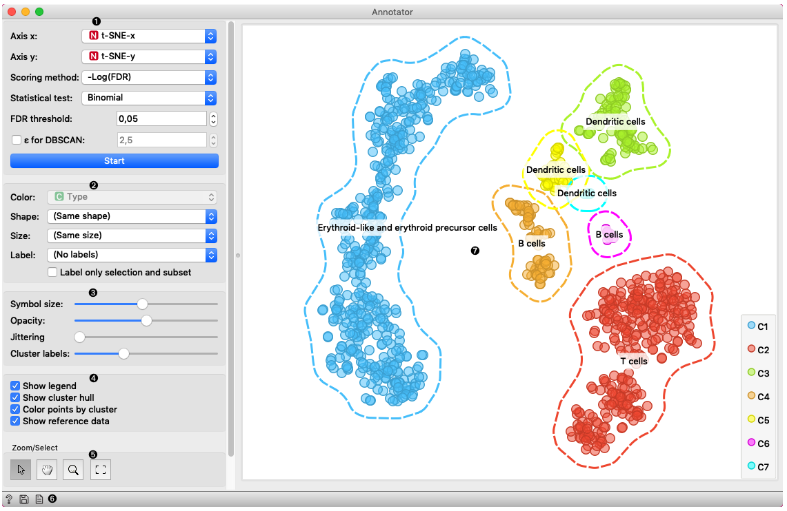
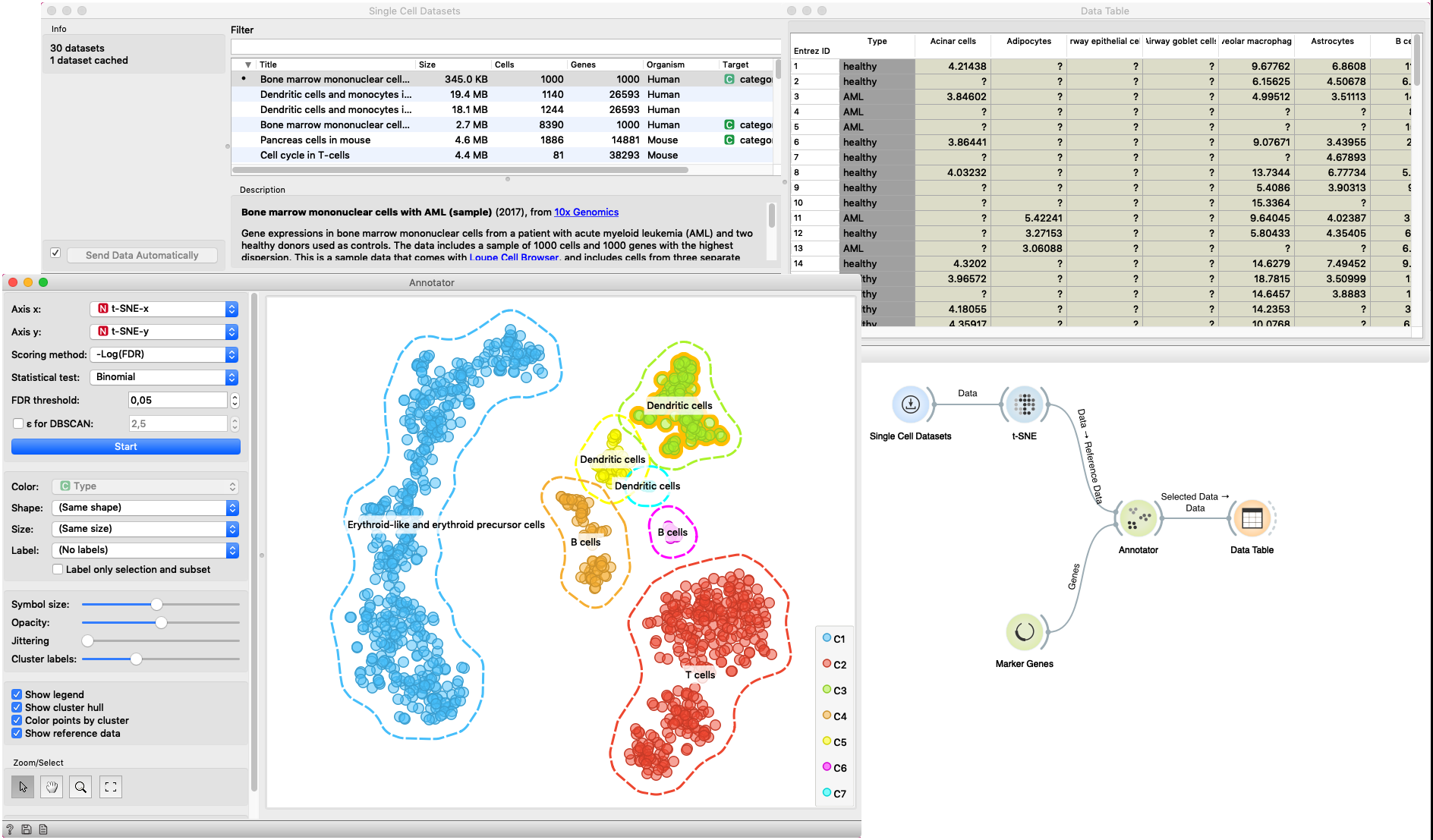
In this example Single Cell Datasets widget provides Bone marrow mononuclear cells with AML (sample) gene expression dataset and t-SNE widget maps data into two-dimensional space. Marker Genes widget provides markers genes with cell types to the Annotator widget. The data table receives the output of the Annotator widget and shows items selected in the plot. The widget shows clustered cells projected to the two-dimensional plane. Clusters labels show annotation with the most common label in the cluster. This workflow can be accessed here.
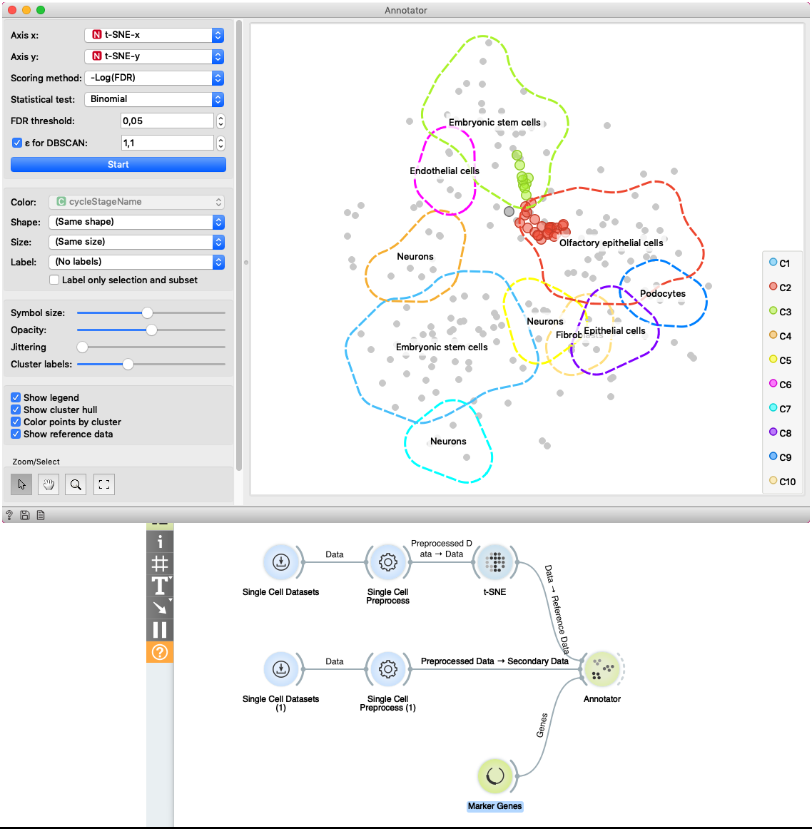
The second example shows how to use Secondary Data input of the widget. We load data with two Single Cell Datasets widgets. First widget loads Cell cycle in mESC (Fluidigm) data which are used as primary data. The second widget loads Cell cycle in mESC (QuartzSeq) dataset for secondary data input. After data are loaded, we normalize them with the Single Cell Preprocess widget and map the reference data to two-dimensional space with the t-SNE projection. Projecting the secondary data is not required since the Annotator widget projects them in the reference space. The Annotator window shows the mapping of secondary data (colored points) to clusters generated on the reference data.