addons, classification, gsoc, gsoc2016, orange3, widget
Visualization of Classification Probabilities
PRIMOZGODEC
Aug 16, 2016
This is a guest blog from the Google Summer of Code project.
Polynomial Classification widget is implemented as a part of my Google Summer of Code project along with other widgets in educational add-on (see my previous blog). It visualizes probabilities for two-class classification (target vs. rest) using color gradient and contour lines, and it can do so for any Orange learner.
Here is an example workflow. The data comes from the File widget. With no learner on input, the default is Logistic Regression. Widget outputs learners Coefficients, Classifier (model) and Learner.
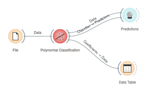
Polynomial Classification widget works on two continuous features only, all other features are ignored. The screenshot shows plot of classification for an Iris data set .
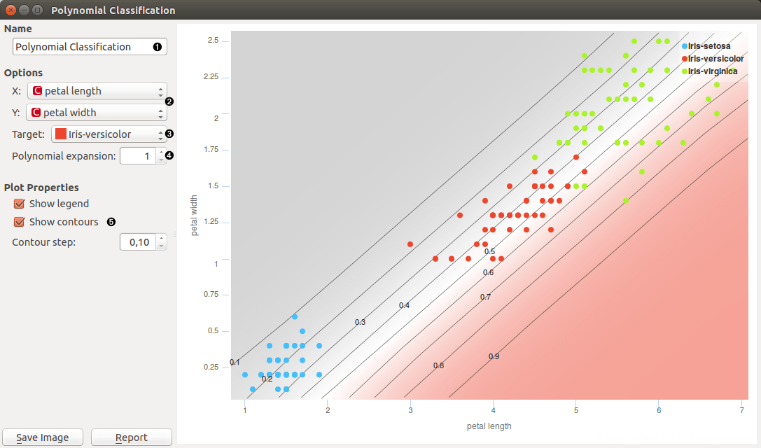
- Set name of the learner. This is the name of learner on output.
- Set features that logistic regression is performed on.
- Set class that is classified separately from other classes.
- Set the degree of a polynom that is used to transform an input data (1 means attributes are not transformed).
- Select whether see or not contour lines in chart. The density of contours is regulated by Contour step.
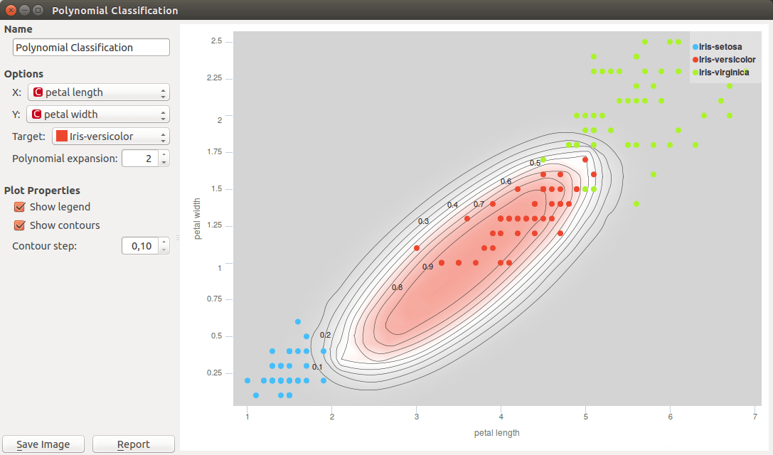
The classification for our case fails in separating Iris-versicolor from the other two classes. This is because logistic regression is a linear classifier, and because there is no linear combination of the chosen two attributes that would make for a good decision boundary. We can change that. Polynomial expansion adds features that are polynomial combinations of original ones. For example, if an input data contains features [a, b], polynomial expansion of degree two generates feature space [1, a, b, a2, a b, b2]. With this expansion, the classification boundary looks great.
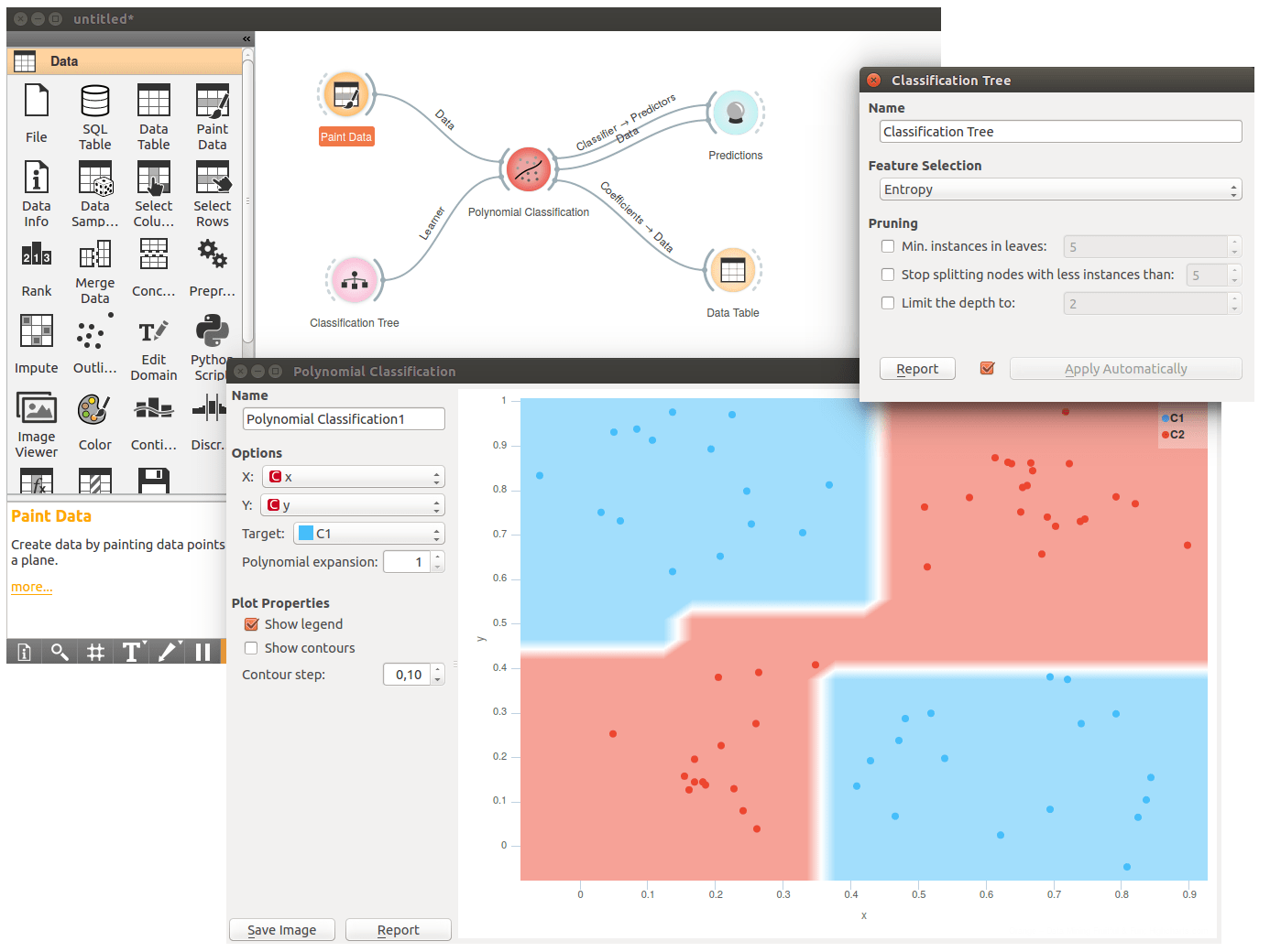
Polynomial Classification also works well with other learners. Below we have given it a Classification Tree. This time we have painted the input data using Paint Data, a great data generator used while learning about Orange and data science. The decision boundaries for the tree are all square, a well-known limitation for tree-based learners.
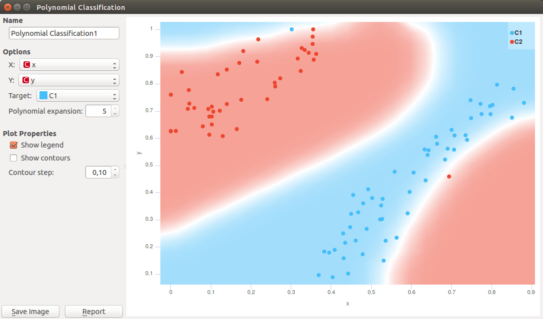
Polynomial expansion if high degrees may be dangerous. Following example shows overfitting when degree is five. See the two outliers, a blue one on the top and the red one at the lower right of the plot? The classifier was unnecessary able to separate the outliers from the pack, something that will become problematic when classifier will be used on the new data.
Overfitting is one of the central problems in machine learning. You are welcome to read our previous blog on this problem and possible solutions.