analysis, education, examples, orange3, overfitting, plot, regression, tutorial
Overfitting and Regularization
BLAZ
Mar 12, 2016
A week ago I used Orange to explain the effects of regularization. This was the second lecture in the Data Mining class, the first one was on linear regression. My introduction to the benefits of regularization used a simple data set with a single input attribute and a continuous class. I drew a data set in Orange, and then used Polynomial Regression widget (from Prototypes add-on) to plot the linear fit. This widget can also expand the data set by adding columns with powers of original attribute x, thereby augmenting the training set with x^p, where x is our original attribute and p an integer going from 2 to K. The polynomial expansion of data sets allows linear regression model to nicely fit the data, and with higher K to overfit it to extreme, especially if the number of data points in the training set is low.
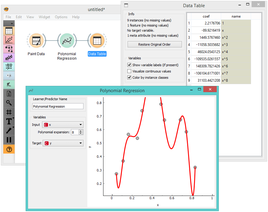
We have already blogged about this experiment a while ago, showing that it is easy to see that linear regression coefficients blow out of proportion with increasing K. This leads to the idea that linear regression should not only minimize the squared error when predicting the value of dependent variable in the training set, but also keep model coefficients low, or better, penalize any high value of coefficients. This procedure is called regularization. Based on the type of penalty (sum of coefficient squared or sum of absolute values), the regularization is referred to L1 or L2, or, ridge and lasso regression.
It is quite easy to play with regularized models in Orange by attaching a Linear Regression widget to Polynomial Regression, in this way substituting the default model used in Polynomial Regression with the one designed in Linear Regression widget. This makes available different kinds of regularization. This workflow can be used to show that the regularized models less overfit the data, and that the overfitting depends on the regularization coefficient which governs the degree of penalty stemming from the value of coefficients of the linear model.
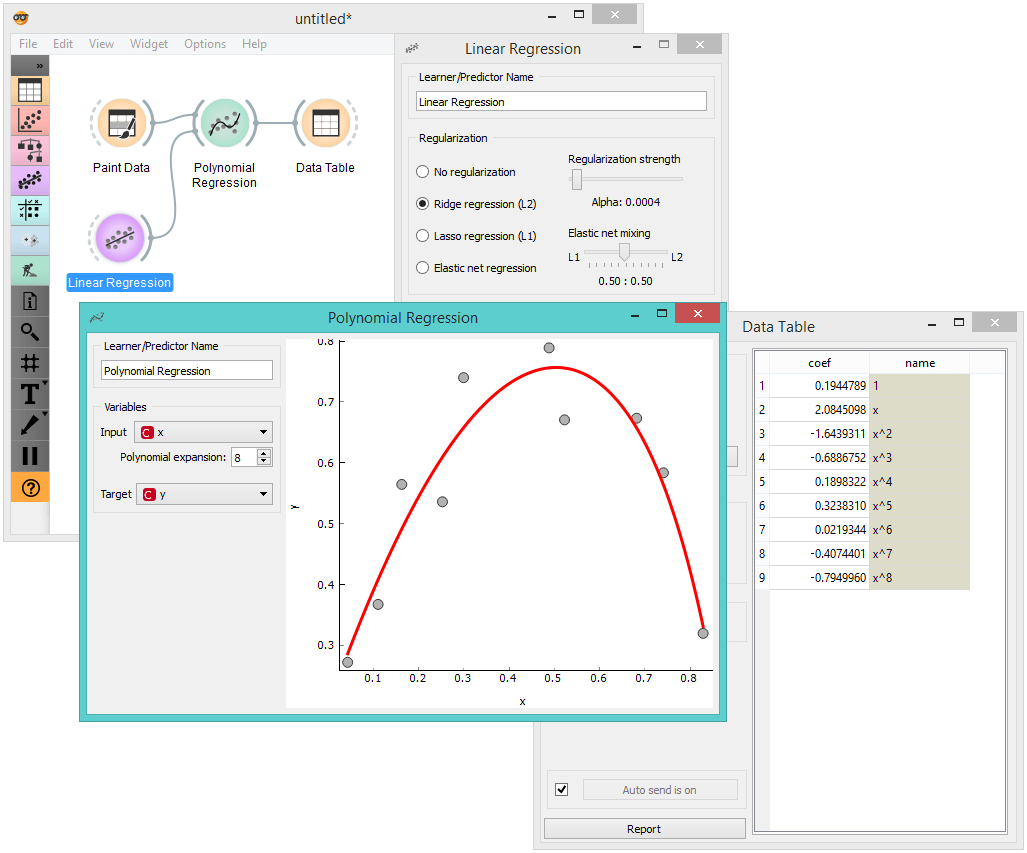
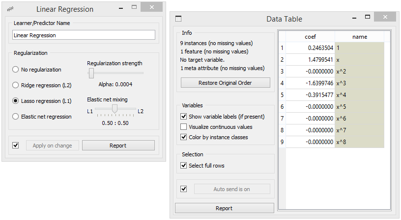
I also use this workflow to show the difference between L1 and L2 regularization. The change of the type of regularization is most pronounced in the table of coefficients (Data Table widget), where with L1 regularization it is clear that this procedure results in many of those being 0. Try this with high value for degree of polynomial expansion, and a data set with about 10 data points. Also, try changing the regularization regularization strength (Linear Regression widget).
While the effects of overfitting and regularization are nicely visible in the plot in Polynomial Regression widget, machine learning models are really about predictions. And the quality of predictions should really be estimated on independent test set. So at this stage of the lecture I needed to introduce the model scoring, that is, a measure that tells me how well my model inferred on the training set performs on the test set. For simplicity, I chose to introduce root mean squared error (RMSE) and then crafted the following workflow.
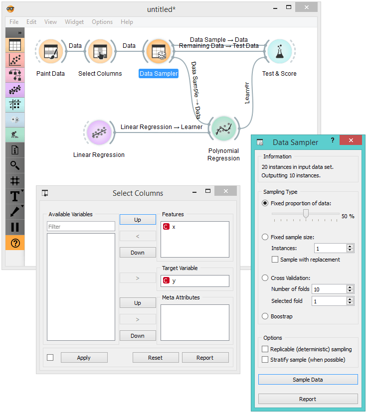
Here, I draw the data set (Paint Data, about 20 data instances), assigned y as the target variable (Select Columns), split the data to training and test sets of approximately equal sizes (Data Sampler), and pass training and test data and linear model to the Test & Score widget. Then I can use linear regression with no regularization, and expect how RMSE changes with changing the degree of the polynomial. I can alternate between Test on train data and Test on test data (Test & Score widget). In the class I have used the blackboard to record this dependency. For the data from the figure, I got the following table:
		Poly K, RMSE Train, RMSE Test
		0,       0.147,      0.138
		1, 		 0.155, 	 0.192
		2, 		 0.049, 	 0.063
		3, 		 0.049, 	 0.063
		4, 		 0.049, 	 0.067
		5, 		 0.040, 	 0.408
		6, 		 0.040, 	 0.574
		7, 		 0.033, 	 2.681
		8, 		 0.001, 	 5.734
		9, 		 0.000, 	 4.776
That's it. For the class of computer scientists, one may do all this in scripting, but for any other audience, or for any introductory lesson, explaining of regularization with Orange widgets is a lot of fun.