Choropleth Map
A thematic map in which areas are shaded in proportion to the measurement of the statistical variable being displayed.
Inputs
- Data: input dataset
Outputs
- Selected Data: instances selected from the map.
- Data: data with an additional column showing whether a point is selected
Choropleth provides an easy way to visualize how a measurement varies across a geographic area or show the level of variability within a region. There are several levels of granularity available, from countries to states, counties, or municipalities.
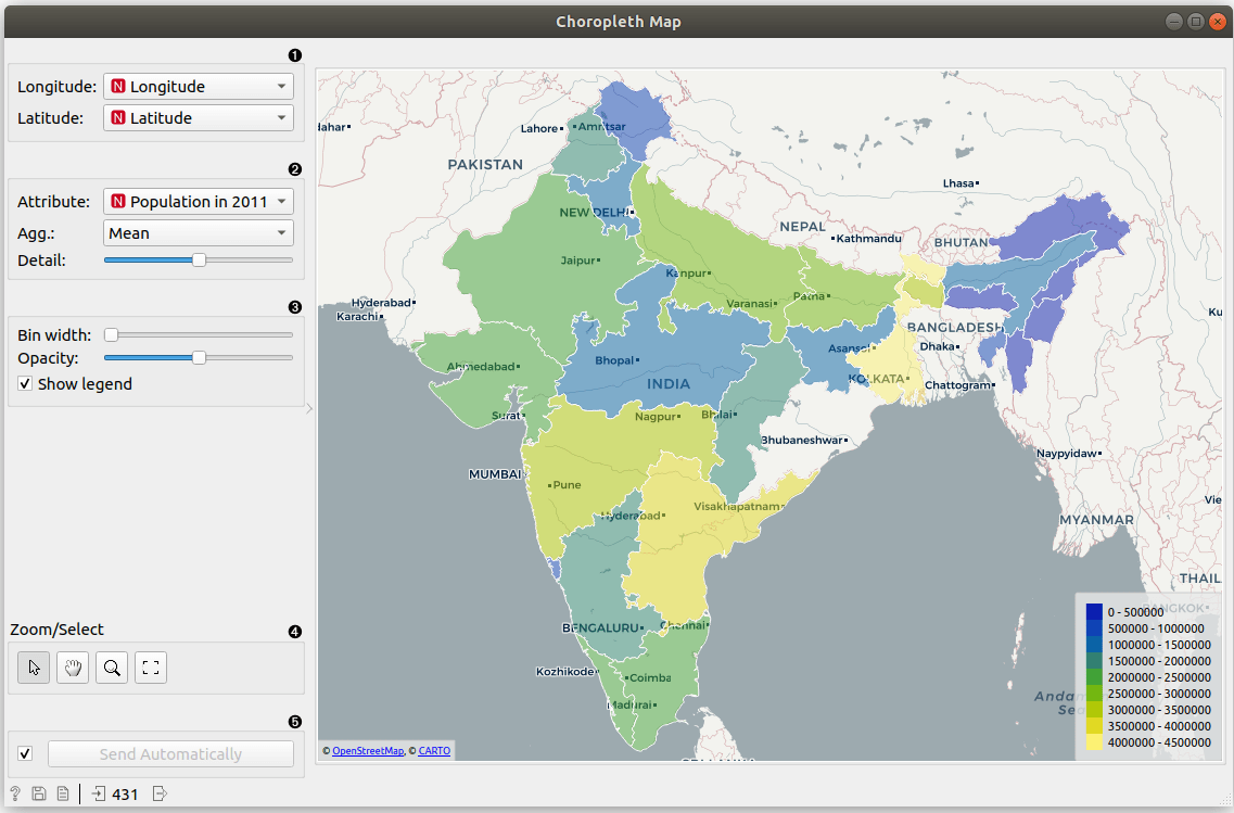
- Set latitude and longitude attributes, if the widget didn't recognize them automatically.
- Set Attribute to color the region by. Set Agg. which by default counts the number of occurrences of the region in the data. Count defined shows which regions appear in the data. Sum, Mean, Median, Maximal, Minimal and Std. (standard deviation) work for numeric data, while Mode works for categorical. Set Detail level to countries, states (US)/counties/Bundesländer/provinces or counties (US)/municipalities.
- Adjust plot properties:
- Bin width for discretize displayed color.
- Opacity sets transparency of regions.
- Show legend displays a legend on the right. Click and drag the legend to move it.
- Select, zoom, pan and zoom to fit are the options for exploring the map. The manual selection of data instances works as an angular/square selection tool. Scroll in or out for zoom.
- If Send automatically is ticked, changes are communicated automatically. Alternatively, press Send.
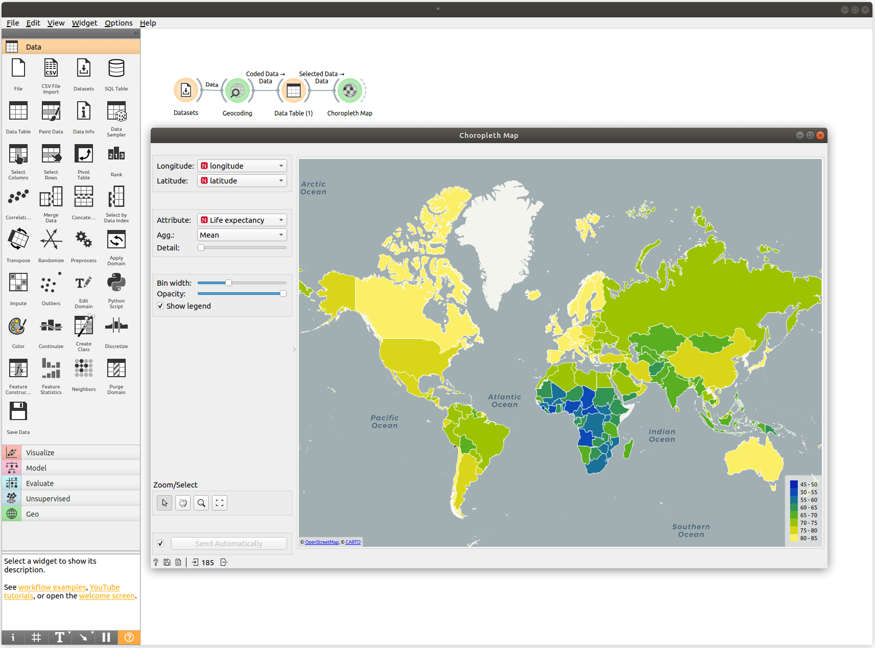
Example
We will use HDI data from the Datasets widget. Open the widget, find HDI data and double click. Choropleth widget requires latitude and longitude pairs, so we will use Geocoding to extract this information. We used the attribute Country and found lat/lon pairs that Choropleth can use.
Choropleth will automatically look for attributes named latitude, longitude, lat, lon or similar. It will use them for plotting. Alternatively, set the attributes manually.
Since HDI attribute is our target variable, it will automatically be used for coloring. We change it in the Attribute dropdown to Life expectancy. We have set the level of aggregation to Mean, but since we have only one value per country, we could use Sum or Median just as well.
The widget shows life expectancy as reported by the United Nations per country. Yellow countries are those with a high Life expectancy and blue ones are the ones with a low life expectancy.
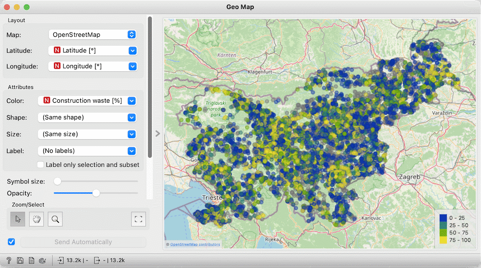
Choropleth can also aggregate data for points belonging to the same region. The data on Illegal waste dumps in Slovenia (available through the Datasets widget) contains coordinates of dumps sites and the composition of the waste. Suppose that we are interested in the proportion of construction waste. Shown in Geo Map and coloring points by that feature, the map looks like this:
Choropleth can provide a much better picture: we set the Detail to maximum, choose Construction waste and show its mean.
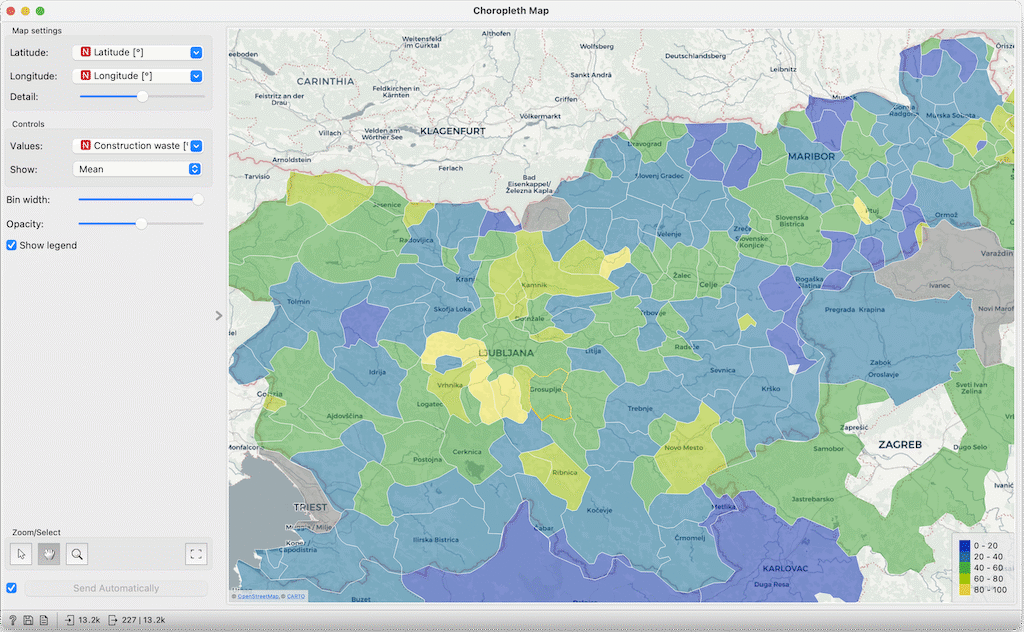
Dumps with the largest proportion of construction waste (or the lowest proportion of other types?) can be found in central Slovenia.