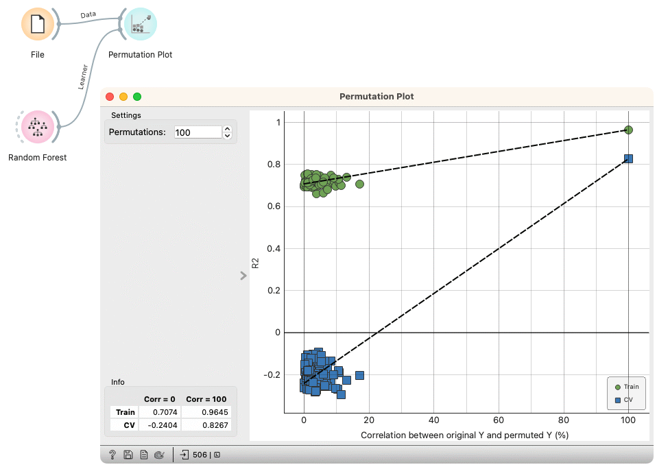
Permutation Plot
Check the validity and the degree of overfit for the input learner.
Inputs
- Data: input dataset
- Learner: learning algorithm
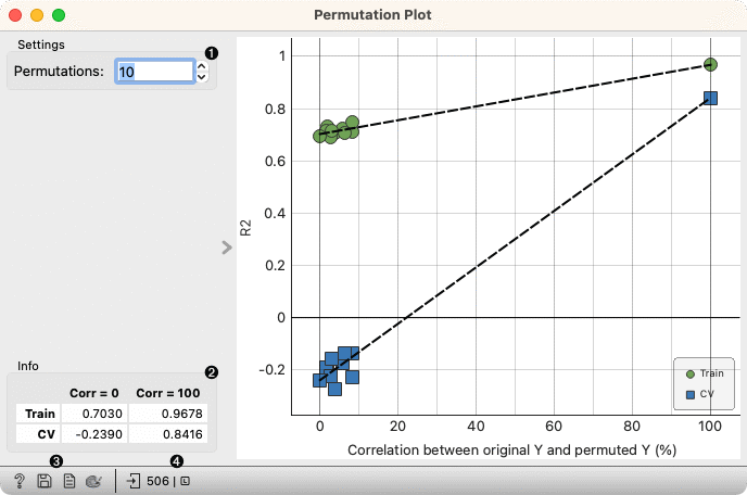
- Select the number of permutations. The target variable is randomly permuted and the learner is fitted to each permuted dataset.
- Information on the model performance.
- Get help, save the plot, make the report, set plot properties.
- Observe the size and type of inputs.
The Permutation plot displays the Spearman's rank correlation coefficient between the permuted and original target variable on the x-axis versus the model score (R2 for regression, AUC for classification) on the y-axis. Two sets of points are shown, one for evaluations on the training data and one for cross-validation. A regression line is fitted to each set of points. The intercept is a measure of the overfit.
Examples
Here is an example on the housing data, where we analyze the performance of a Random Forest model.