Teach with Orange
Education in Data Science
Orange is the perfect tool for hands-on training. Teachers enjoy the clear program design and the visual explorations of data and models. Students benefit from the flexibility of the tool and the power to invent new combinations of data mining methods. The educational strength of Orange comes from the combination of visual programming and interactive visualizations. We have also designed some educational widgets that have been explicitly created to support teaching.
Here are a few example workflows that we have used recently in data mining training (yes, we do not only develop Orange, we teach with it as well).
Linear Regression
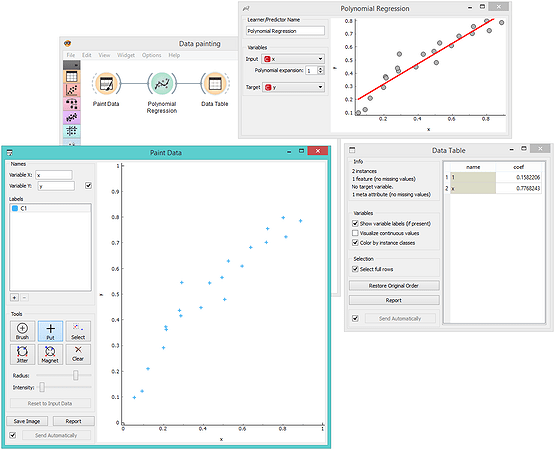
Wouldn't be great if we could just paint data and with each new data point observe how linear regression fits the line? In Orange, there's a widget for data painting and a polynomial regression widget (from the educational add-on) to display the fitted model.
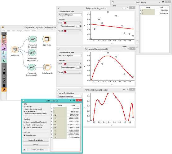
Overfitting
Not everything is a line. We can use linear regression on augmented data input with added columns for powers of input features. This is called polynomial regression. It is guaranteed to surprise students. Using a linear model you can now discover non-linear functions. But you can also heavily overfit the training data. For say two, three ... or ten input data points, what is the degree of polynomial expansion for the linear model to perfectly fit the data? When linear models overfit, model coefficients become very high. It is so easy to play with this in Orange: add some data here, raise or lower the degree of polynomial there...
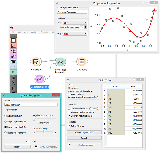
Regularization
If overfitting leads to the explosion of the values of the coefficients, it could easily be prevented by requesting the optimization to keep these low. That is exactly the idea behind regularization. In the workflow below, Polynomial Regression was given a regularized model. No more overfitting! It is also great to explore how the strength of regularization smooths the resulting model and reduces the values of coefficients.
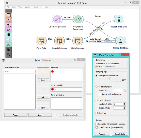
Always Evaluate Models on the Test Data
The following workflow is a bit more complex. We split the painted data to a training and test set. This time, as we use standard Orange widgets for learning, we need to declare that y is a class attribute. We do this in the Select Columns widget. We then evaluate the linear regression model with polynomial expansion on the training data and on the separate test data.
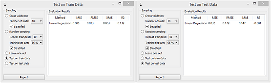
Overfitted models have small errors on training data, but large errors on test data. To escape this, regularization helps. With it, the error on the test data is lower, while the error on the training data increases. Huh! The error on training data set is thus not a good indicator of the predictive power of the model. While this looks simple, everything in machine learning is about how to design models that will work well on the data they have not seen in training.
When teaching, the workflow presented here needs quite some thought and time. It should come after we explain linear regression, polynomial expansion, overfitting and regularization. But it gives so much freedom for students to explore: consider the interplay of different complexity of (painted) data set, degrees of polynomial expansion, and the effects of regularization. Plus, it provides us (teachers and trainers) the opportunity to talk about regression scoring and nicely leads to the introduction of cross-validation. Oh, the richness and art of data mining...
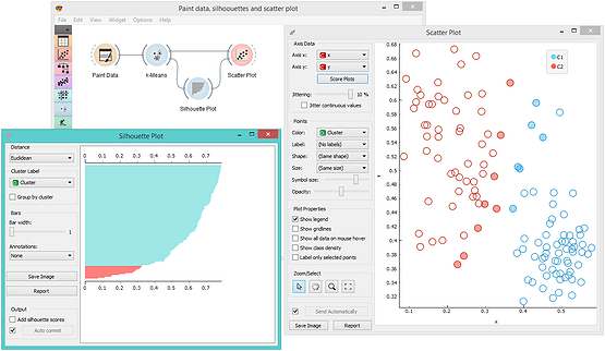
Experimenting with k-Means Clustering
After the intro on k-means clustering algorithms (there is a widget from educational add on to support this), a great exercise for students is to check when the algorithm works and where it fails. Painting the data helps again! Say, for the smiley data set, k-means guided by silhouette scoring finds four clusters instead of three. Orange widgets can be set to automatic commit (Send Automatically) so that every time we change the input data, the signals propagate through the workflow for the users to immediately see the consequences of the changes. Can you paint a smiley data set where even clustering with k=3 would fail?

Scoring of Clustering Models
We did mention the clustering silhouette, right? It is the easiest approach to score the clustering. Silhouettes are estimated on data instances, and the silhouette of a clustering is the mean across data instance silhouettes. A high silhouette means that a data instance is surrounded by instances from the same cluster, while a low silhouette score indicates that data instances are close to another cluster. Orange has a widget that can plot the silhouette scores. And because Orange is all about interactive visualization, you can select silhouettes and check where their data instances are. Like in the workflow below, where we showcase that low silhouettes are assigned to borderline data instances. Silhouette Plot is great when explaining pros and cons of different clustering methods (yes, it works with any method, not just k-means).