analysis, classification, features, interactive data visualization, visualization
Nomogram
AJDA
Jun 05, 2017
One more exciting visualization has been introduced to Orange - a Nomogram. In general, nomograms are graphical devices that can approximate the calculation of some function. A Nomogram widget in Orange visualizes Logistic Regression and Naive Bayes classification models, and compute the class probabilities given a set of attributes values. In the nomogram, we can check how changing of the attribute values affect the class probabilities, and since the widget (like widgets in Orange) is interactive, we can do this on the fly.
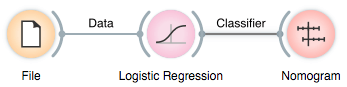
So, how does it work? First, feed the Nomogram a classification model, say, Logistic Regression. We will use the Titanic survival data that comes with Orange for this example (in File widget, choose "Browse documentation datasets").
In the nomogram, we see the top ranked attributes and how much they contribute to the target class. Seems like a male third class adult had a much lower survival rate than did female first class child.
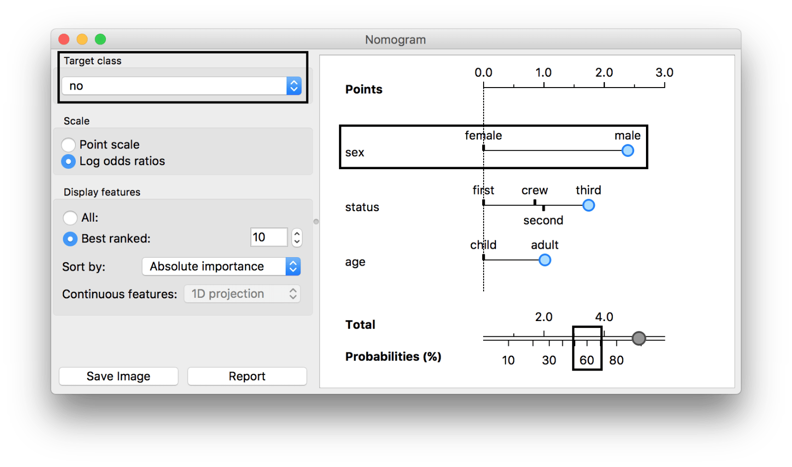
The first box show the target class, in our case survived=no. The second box shows the most important attribute, sex, and its contribution to the probability of the target class (more for male, almost 0 for female). The final box shows the total probability of the target class for the selected values of attributes (blue dots).
The most important attribute, however, seems to be 'sex', where the chance for survival (target class = no) is lower for males than it is for females. How do I know? Grab the blue dot over the attribute and drag it from 'male' to 'female'. The total probability for dying on Titanic (survived=no) drops from 89% to 43%.
The same goes for all the other attributes - you can interactively explore how much a certain value contributes to the probability of a selected target class.
But it gets even better! Instead of dragging the blue dots in the nomogram, you can feed it the data. In the workflow below, we pass the data through the Data Table widget and then feed the selected data instance to the Nomogram. The Nomogram would then show what is the probability of the target class for this particular instance, and it would "explain" what are the magnitudes of contributions of individual attribute values.
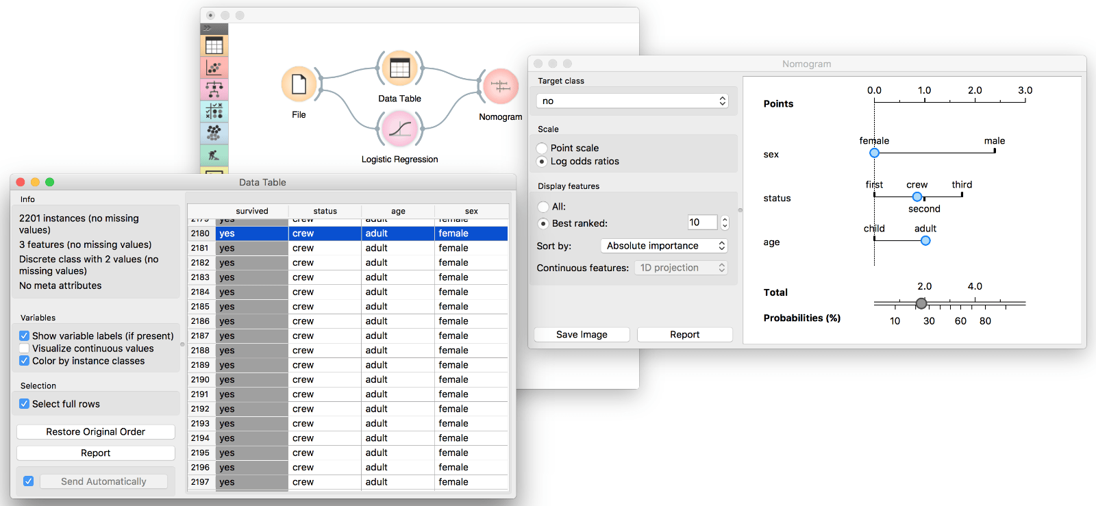
This makes Nomogram a great widget for understanding the model and for interactive data exploration.