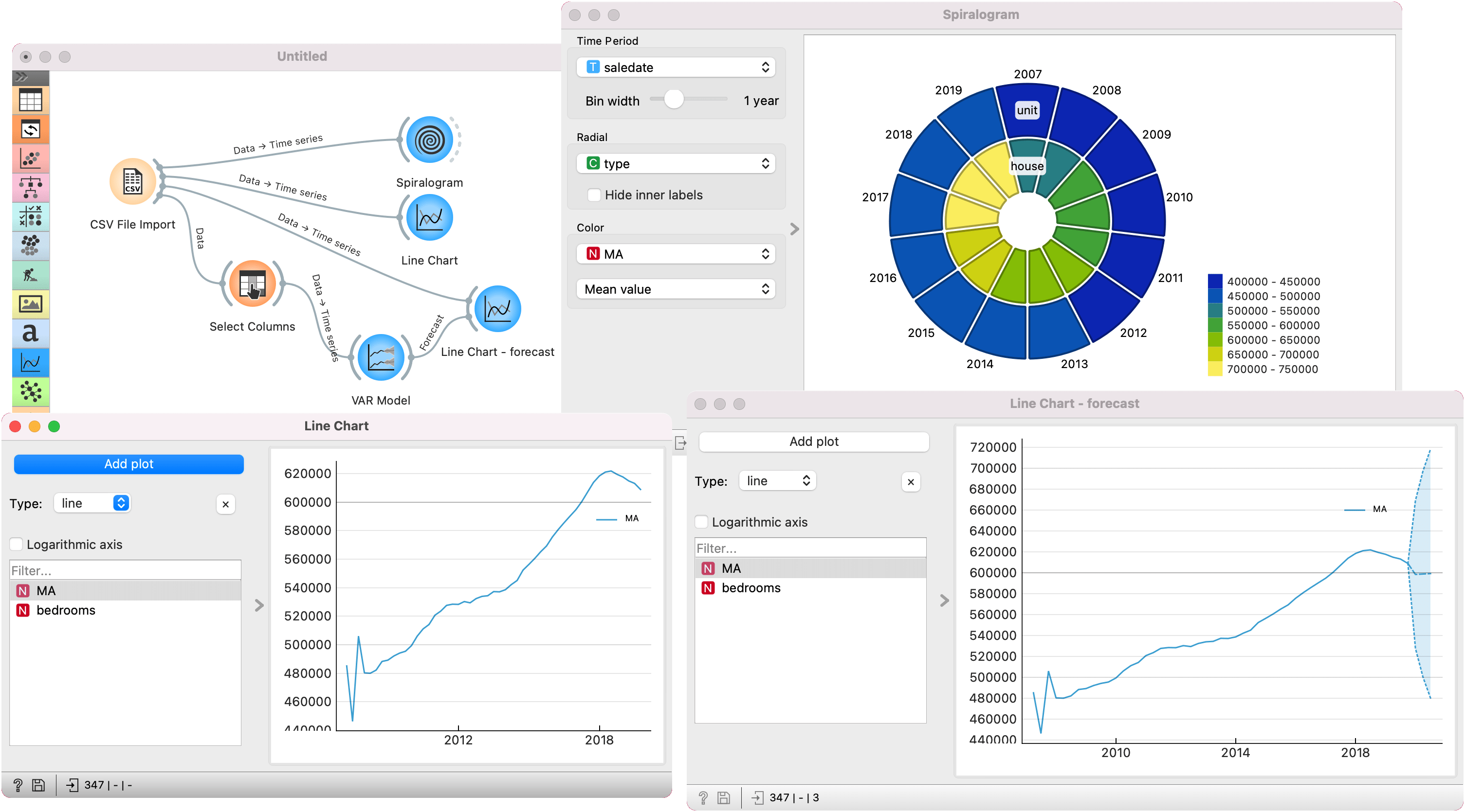
timeseries, line chart, spiralogram, prediction, VAR model
Timeseries add-on lost a lot of weight
Ajda Pretnar Žagar
Aug 04, 2022
The Timeseries add-on has been on a backlog for quite some time now. Mostly because a bulk of its visualizations have been written in Highcharts, a visualization library built on JavaScript. We're Python developers, so none of us felt comfortable touching anything JS. Moreover, Highcharts is not fully open source, so licensing is a potential issue for certain Orange users.
There was only one person who could (and would) tackle this - our senior developer Vesna. She is a whiz with creating beautiful visualization widgets (see Bar Plot and Line Plot!) and in a few weeks she managed to rewrite Line Chart to PyQt. The path towards this major milestone was paved by Janez, who rewrote Correlogram, Spiralogram, and Periodogram. The changes resolved a large proportion of issues in Timeseries, making the add-on now much more reliable. The changes are available in the Timeseries version 0.5.0.
Here's a simple example of timeseries analysis in Orange. I've used Kaggle's House Property Sales Time Series data, specifically the ma_lga_12345.csv file containing 347 records of real estate sales, each presented with the date of the sale (in quarter of the year), the median price (smoothed with moving average), property type (unit or house) and the number of bedrooms (1-5).
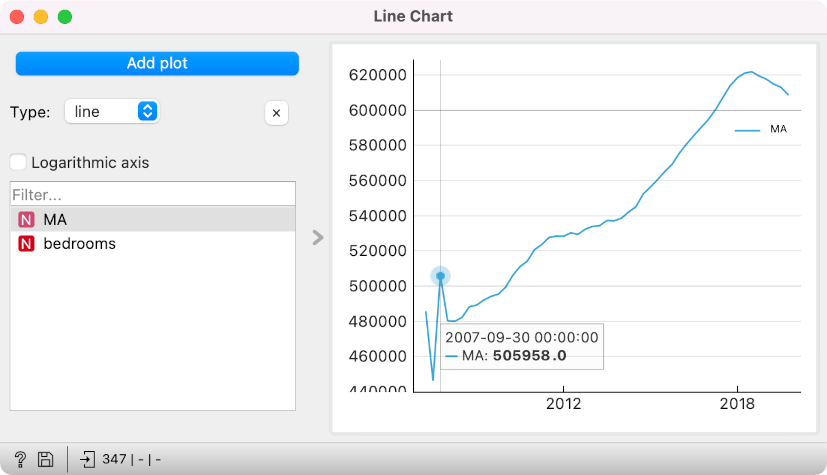
First, let us observe the data in a line chart. Select the MA variable. It looks like the first couple of quarters in 2007 varied a bit (probably due to a lack of data when smoothing was applied), but then the prices rise steadily until a downward turn in 2018.
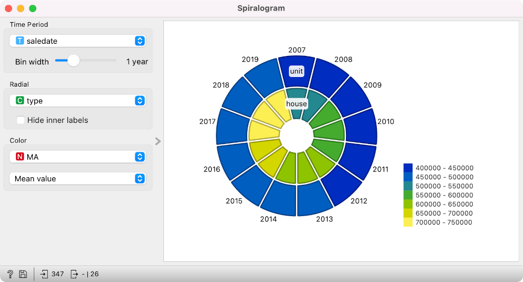
In spiralogram, we can inspect the same variable, this time split into years, separated into units and houses, and displaying a mean value of MA for each slice. Evidently, houses are much more expensive than units. Now change type to bedrooms. When does large real estate (5+ bedrooms) become noticeably more expensive?
Let us conclude this with a short example in predictive modelling. Say we wish to predict the median price based on the number of bedrooms and the type of real estate. We have to first set MA as the target variable with Select Columns. Then, we pass the data to VAR model, an autoregressive model for predicting timeseries. Finally, we use another Line Chart, to which we pass both the original timeseries and the forecast from the VAR model. In the right-most section of the plot, we see the prediction (the dashed line) and the confidence intervals (the blue area). While the model predicts the price to stay at around 600k, the confidence intervals are very wide, making this an uncertain prediction.