regression, confusion matrix, scatter plot, prediction error
Confusion matrix for regression?
Ajda Pretnar Žagar
May 20, 2022
It is easy to inspect misclassifications in the Confusion Matrix widget when building classification models. One can even click on misclassified instances, output them and observe them in various visualizations. But what about regression? Predicting numeric values doesn't even allow connecting Confusion Matrix, nor would it make sense. So how can one inspect prediction error for regression tasks?
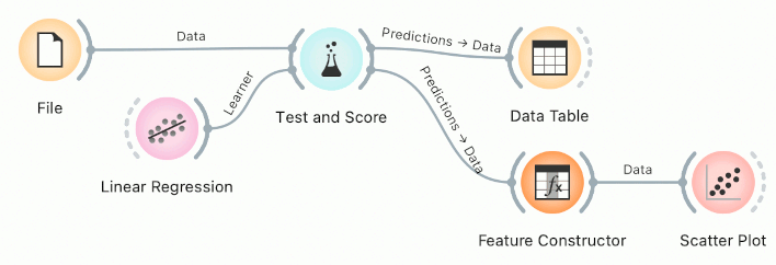
Let us take the well-known housing data set from the File widget. The dataset has 506 instances of houses described with 13 variables and a regression target variable MEDV (median value of homes in 1000$).
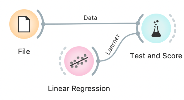
We can quickly build a simple workflow with Test and Score and Linear Regression, which estimates model accuracy and outputs predictions.
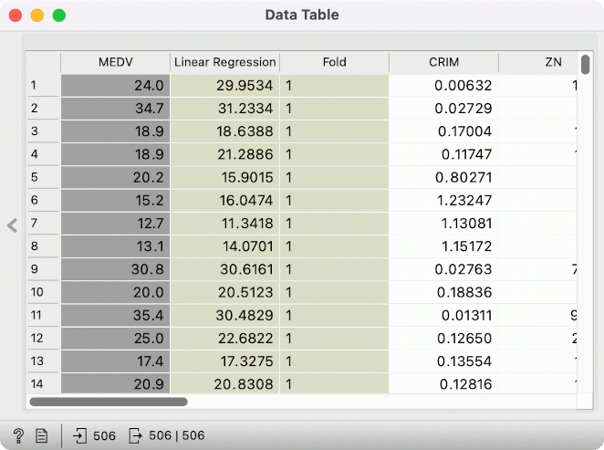
Looking at predictions in a Data Table, we can see the true value in the grey column (MEDV) and the predicted value in the beige column (Linear Regression). But it is nigh impossible to extract any meaningful information just by looking at true and predicted values in a table. A visualization would be nice.
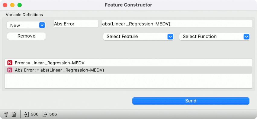
Let us connect Feature Constructor to Test and Score. We will create two new variables in the Feature Constructor, both numeric. Click on New --> Numeric, give it a name, say Error and define the function for computing the prediction error. We will pass it a simple subtraction Linear_Regression-MEDV, which subtracts the true value from the predicted value. In this way, we will get negative values for underpredicted instances and positive values for overpredicted instances.
For a more in-depth inspection, create a variable Abs Error, computing the absolute error with abs(Linear_Regression-MEDV).
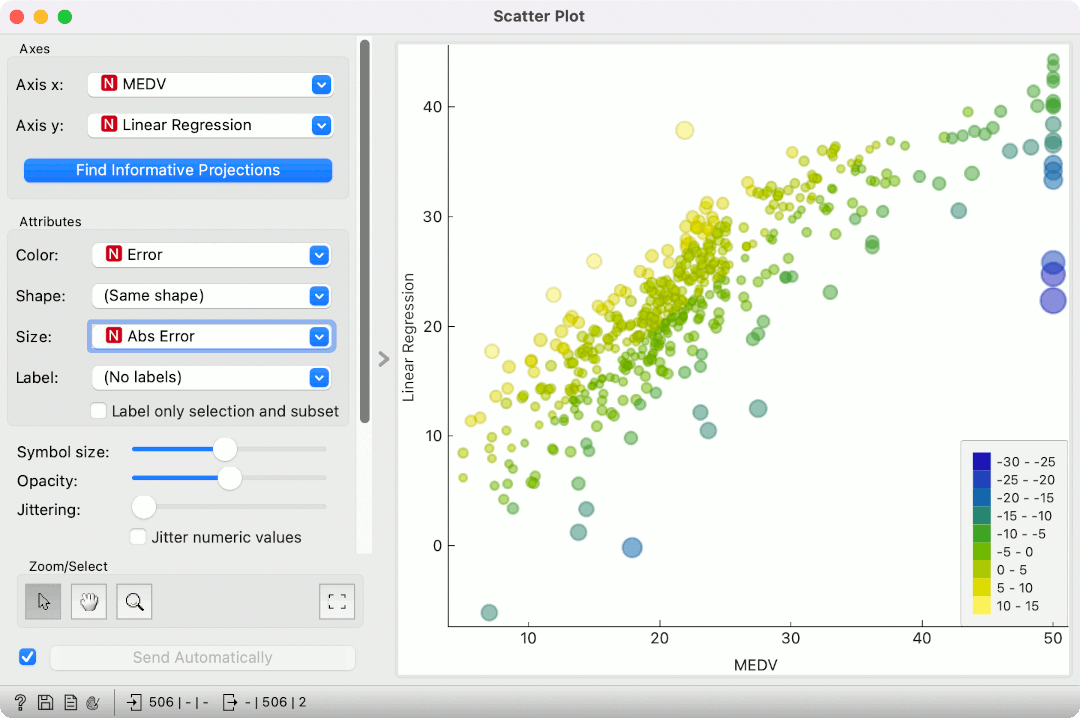
Now, we can inspect the predictions in a Scatter Plot. Set MEDV for x-axis and Linear Regression for y-axis. Color by Error and set the size to Abs Error. Since we are using simple linear regression, the results are more or less as expected. Everything above the imaginary regression line will be colored yellow (overprediction) and below it blue (underpredictions). The larger the point, the larger the prediction error. We can see some strange predictions in the top right corner of the plot. We can select them and inspect them downstream.
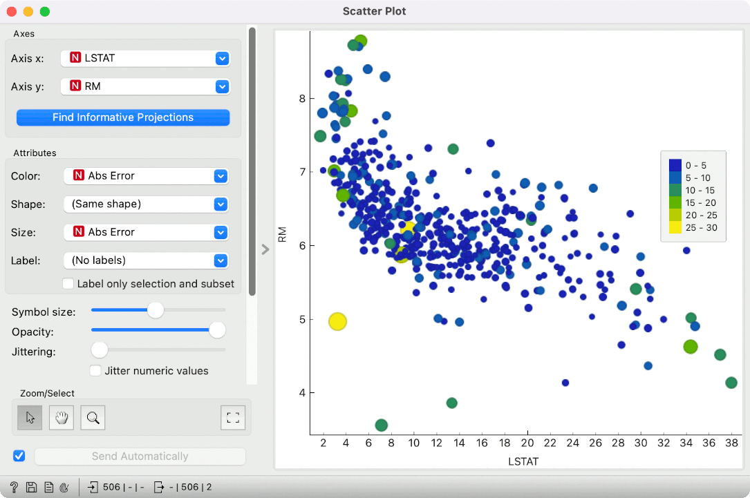
Alternatively, we can observe the absolute error in the feature space. Let us select LSTAT and RM variables in the scatter plot. Now, color by Abs Error and set the same variable for size. We can observe two correlated variables (LSTAT and RM) and inspect where the failed predictions lie. They are more frequent in the lower and higher LSTAT values.
Now you have no more excuses not to check prediction errors for regression tasks! :)