visualization, data mining, box plot, scatter plot, distributions
Visualizations 101
Ajda Pretnar
Dec 17, 2021
Orange has a wide array of visualizations, which enable exploring the data from different perspectives. But each visualization is unique - it is used for a specific purpose, which is closely related to how one interprets the plot. Let's have a look at the most common visualizations in Orange, when to use them and how to read them. We will use the heart_disease.tab data set from the File widget in the next examples.
Scatter Plot
Scatter plot is suitable for displaying a relationship between two numeric variables. It shows a 2-dimensional plot where points represent data instances (rows). The position of each point is defined by its value for x axis and y axis. The plot can also show relations to the third variable, either numeric or categorical, by setting the color, size, or shape of data points.
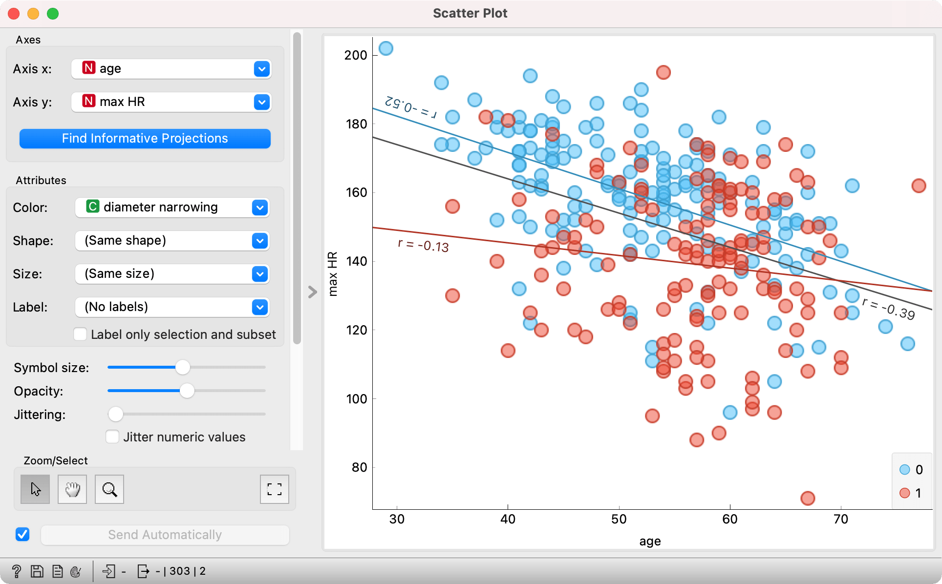
In the above image we see a relationship between age and max HR for the 303 patients in the data set. The color of the point corresponds to the presence or absence of diameter narrowing. We see that the presence of heart disease is slightly more frequent at the age of 60, but the difference is not entirely clear and we should't draw too many conclusions from this. What we can conclude is that the maximum heart rate falls with age - regression lines are sloping downwards. Interestingly, the values of max HR at younger ages are already noticeably lower for patients with diameter narrowing (red points and line). That said, the average maximum heart rate for healthy patients (no diameter narrowing) approaches that for sick patients (with diameter narrowing).
How to read the plot: age and max HR are negatively correlated. The higher the age, the lower the maximum heart rate.
Box Plot
Box plot is perfect for initial exploration of the data set. It shows basic statistics for each variable and it can handle both numeric and categorical variables.
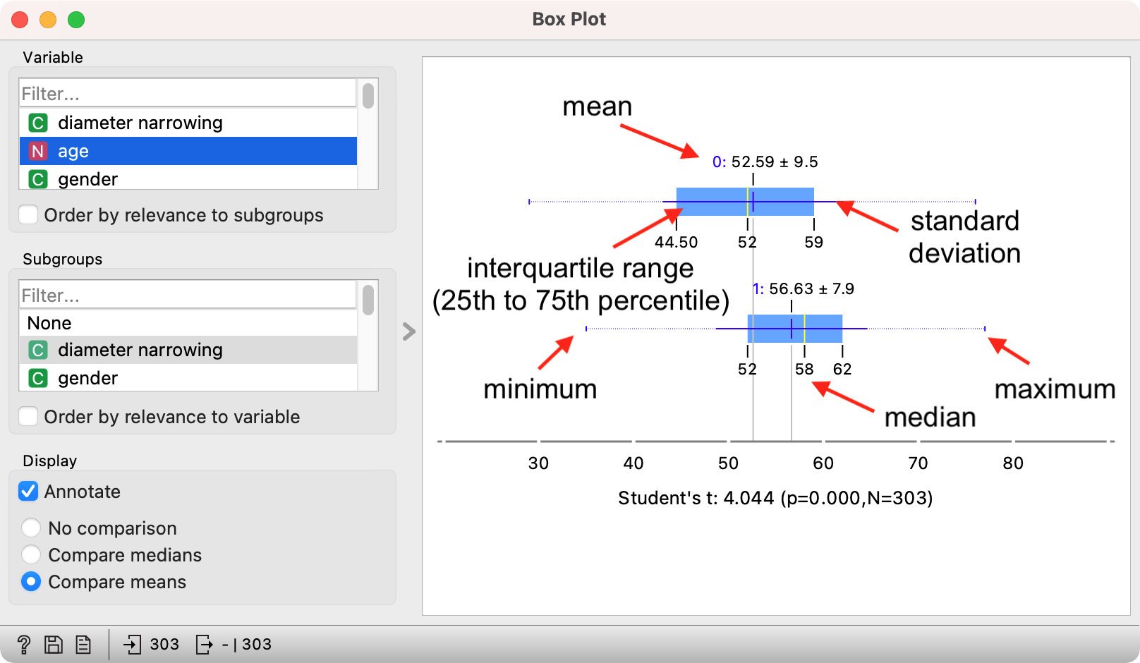
Box plot for numeric variables shows a whisker plot, which displays essential statistics. Above is an example with the age variable, which is by default split by the target variable diameter narrowing in Orange. The visualization shows two box plots, one for each target value (patients with and without diameter narrowing).
The yellow vertical line shows the median value for each box. The blue vertical line shows the mean with the standard deviation represented by the horizontal thin blue line, which shows how "spread out" the values in the sample are. The big blue box is the data between the 25th and 75th percentile, that is the central 50% of the data. The line on the left extends to the minimum value, while the line of the right extends to the maximum value.
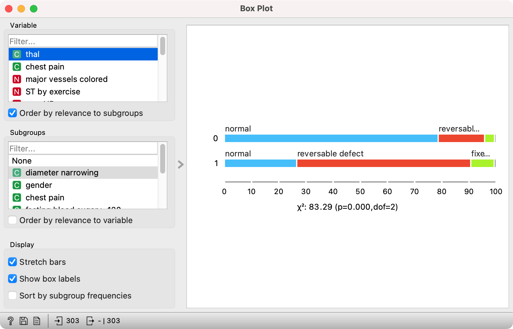
Categorical variables show the number (or proportion) of data instances for each value. These are no longer box plot, but stacked bar charts.
A great option in Orange is setting the Order by relevance to subgroup checkbox, which orders the variables in the top left box by how much their values differ between groups defined by the selected Subgroup variable. It uses Chi-square test for categorical variables and compares the means of numeric variables using Student's T for two and ANOVA for multiple groups. Values of the test statistic are displayed below the plot. Normally, higher values are preferred, but the most important is the p-value - if it is below 0.05, the difference in distributions is generally considered significant.
How to read the plot: thal is the variable that best separates between patients with and without diameter narrowing. There is a higher incidence of reversable defect in patients with diameter narrowing (64% have reversable defect) than in those without diameter narrowing (17% have reversable defect).
Distributions
Distributions show histograms for numeric variables, where values within a given range will be assigned a bin. For categorical data, they show bar plots, that is the frequency of each value. In the below example, there are two bins, one with values below 50.87 and one with values above 50.78.
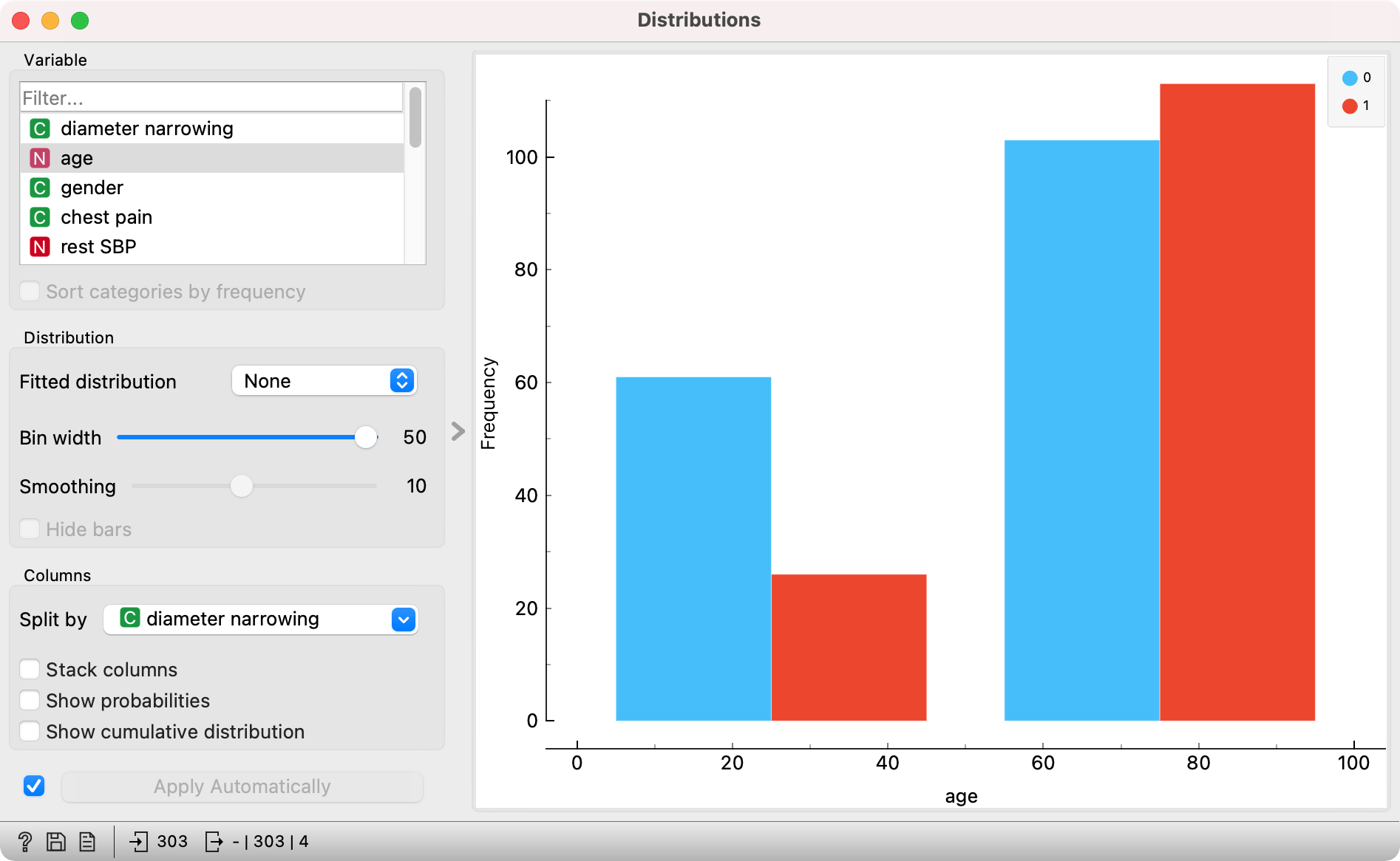
The widget can be used to display differences in distributions.
How to read the plot: In the group of patients that are younger than 50 years, there is a 50% lower presence of diameter narrowing (70 % of patients don't have the condition).
Sieve Diagram
Sieve diagram is a complex, yet extremely useful visualization. It shows the difference between the expected and observed variable frequency. In other words, if a combination of two values, i.e. being 60 years old and having a heart disease, is more frequent than expected, Sieve diagram will show it. Hence it is primarily intended for categorical variables - numeric variables will be discretized.
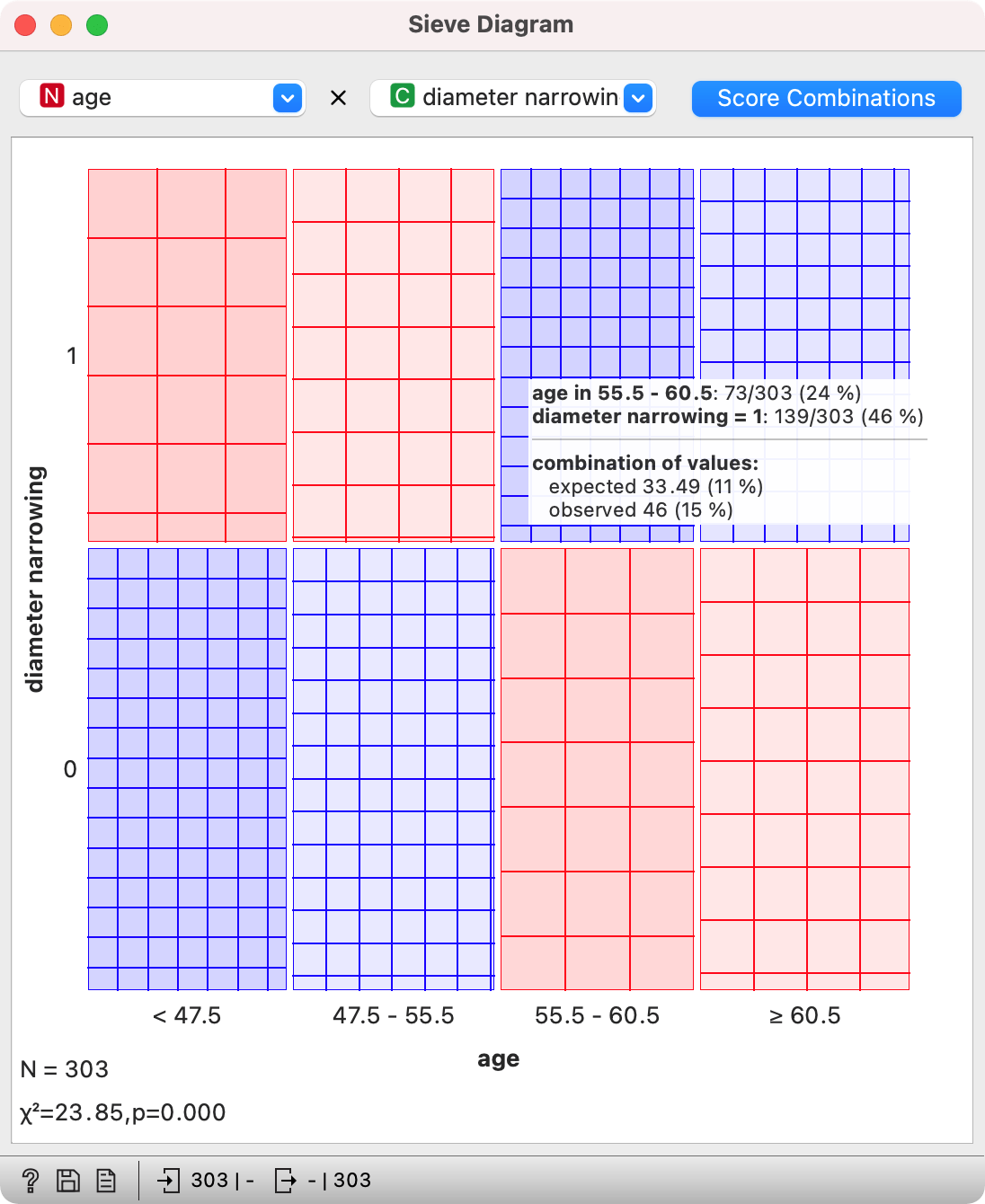
In the scatter plot above, we observed a slightly higher incidence of diameter narrowing in patient around 60 years of age. Let us check this is Sieve diagram.
On y axis we see diameter narrowing, with the size of each box vertically corresponding to the proportion of instances with and without condition. On x axis we see age, with the size of each box horizontally corresponding to the size of each bin. As numeric variables are discretized with equal frequency discretization, the box will always be the same size.
The color of the box corresponds to how overrepresented (blue) or underrepresented (red) a certain combination is. For example, there are 73 patients (24 %) between 55.5 and 60.5 years old in the data set. There are also 139 patients (46%) with diameter narrowing.
If these two variables would be unrelated, we would expect around 11% of patients with both values (0.24 x 0.46 = 0.11), that is patients between 55 and 60 years old with a diameter narrowing.
But if we observe the data set, we can see there are actually 15% of such patients. That is more than we would expect, so a combination of the two values could be statistically significant.
In the left corner of the plot we once again meet the Chi-squared, which tells us how significant the combination actually is.
How to read the plot: Based on the data set, it is more likely the patients between 55 and 60 years of age will have diameter narrowing. The p-value is below 0.05.
Word of caution
Data mining is about finding patterns in the data. But sometimes, patterns are random and correlation does not necessarily mean causation. So be careful when interpreting the results. Always disclose the size of your data set and how it was gathered. Report the results with the awareness, that you are only observing a sample of the population. Remember that p-values are the chance that the null hypothesis is true. Even if the p-value is 0.05, the null hypothesis could still be true - you would actually expect this to happen 5 times out of a 100, so keep this in mind, especially when you test 100+ variables!