covid-19, visualization, addons, geo, time
Data Mining COVID-19 Epidemics: Part 2
Robert Cvitkovič
Apr 13, 2020
Previously on Data Mining COVID-19 Epidemics: Part 1 we fired up a COVID-19 epidemics data set and looked at some basic visualizations. If you haven't got your hands dirty with it yet, check that out first.
In this post, we'll try putting the data on a map. We'll also expand on the "data mining is interactive" mantra by creating some animations showing the epidemics spread throughout the world.
Prerequisite: installing add-ons
Orange already comes with a great selection of widgets that work with all sorts of data. But sometimes we're faced with a particular data set, such as textual data, time-series, or geographical data, which requires widgets with specific functionality – add-ons to the rescue! Add-ons are packages of widgets specially designed to handle specific data types.
We'll be working with the Geo and Timeseries add-ons. To install them, open Options in the menu bar and select Add-ons. A new window will open, showing a list of officially supported add-ons. Select Orange3-Geo and Orange3-TimeSeries and click OK. After installation, restart Orange. Check out the new sections in the widget toolbox; you should see some cool new widgets.
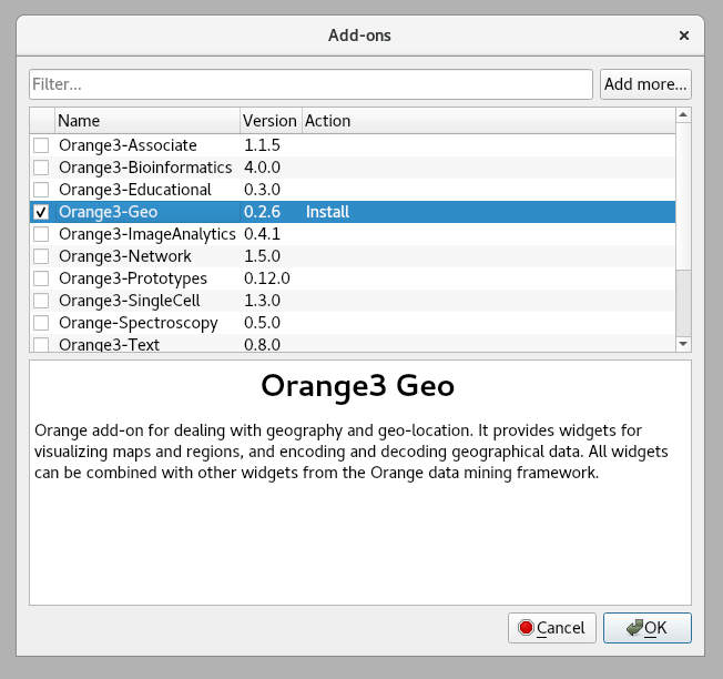
Note: the two add-ons have been revamped very recently. If you already have them, use the Add-ons dialog to upgrade them to the latest version.
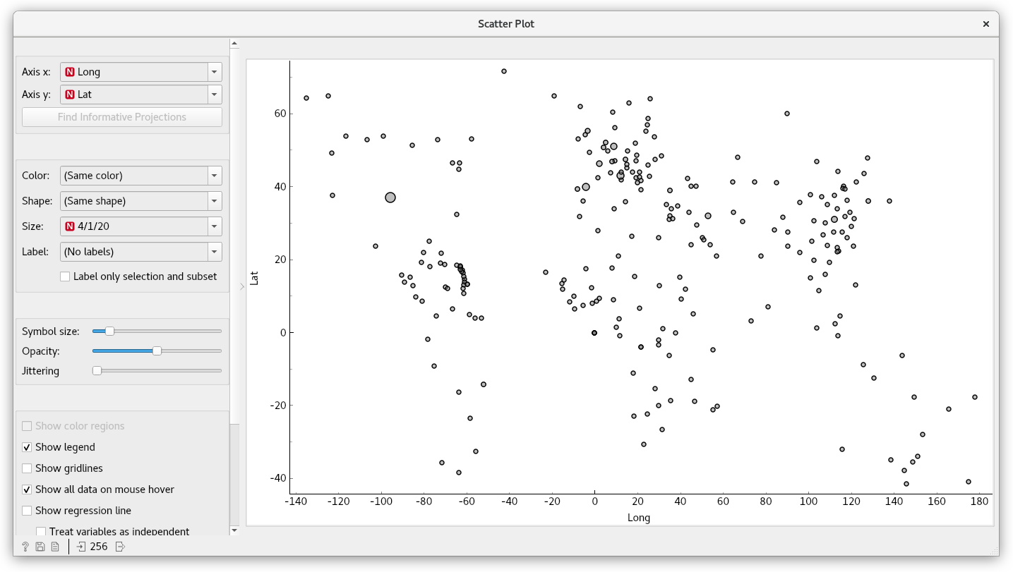
From Scatter Plot to Geo Map
You should already be familiar with the Scatter Plot widget. In the previous blog post, we used it as an impromptu map by putting latitude and longitude on the axes.
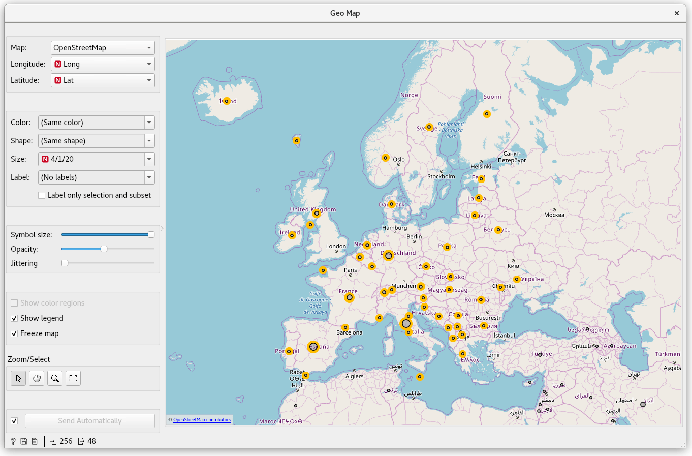
A better solution is to use Geo Map from the Orange3-Geo add-on. It provides a variety of maps as backgrounds. With them, it's much easier to associate points with locations. To start, first load the COVID-19 data set using the File widget, as shown in the previous post. Then, add and connect a Geo Map widget.
Latitude and longitude are automatically selected. Below, you can define similar point properties, as in the scatter plot. The size of a point can intuitively represent the number of cases, so let's select the latest date in the Size dropdown. If you're feeling adventurous, try changing the map type to satellite or topological.
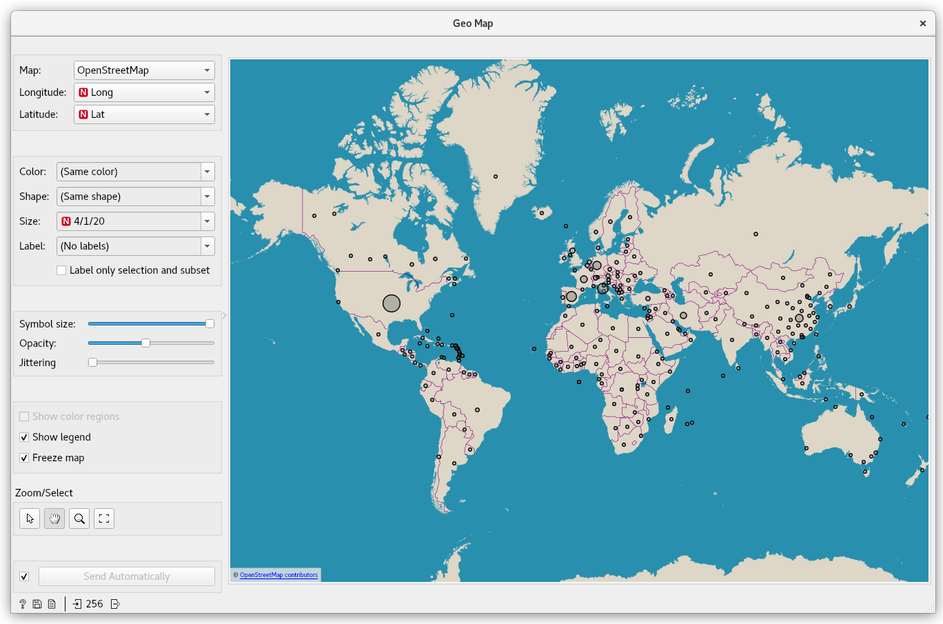
Just like in Scatter Plot, you can scroll to zoom in and out, and click/drag to select data points. As opposed to using Scatter Plot, showing the points over a map of Europe makes it easier to select the countries we want to inspect.
The chloro... chorophl... chloropet... map with areas colored in
The map is nice and informative, and it's easy to distinguish larger epidemics from smaller ones. Still, those similarly-sized points on the map represent entire countries from big Russia to small Slovenia. We could, alternatively, represent countries by coloring their surface area. This is a job for Choropleth Map. Let's add it and connect it.
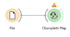
This widget is similar to Geo Map, but instead of displaying data as points, it aggregates them into regions (e.g., Country, State, Province), and displays those instead. Under Attribute, select the latest date and under Agg., select sum. The colored regions now show the sum of confirmed COVID-19 cases for each country.
Try choosing different dates. Notice how China initially experiences rapid growth, followed by a period of stagnation, and how in the past week, the USA overtook all other countries' confirmed COVID-19 case count.
A warning that 7 points are not in any region refers to some small islands and cruise ships included in the data.
If a picture paints a thousand words, an animation paints a million
When working with time-series data, the coolest insights arise from observing trends – how data changes depending on time. Let's animate our maps!
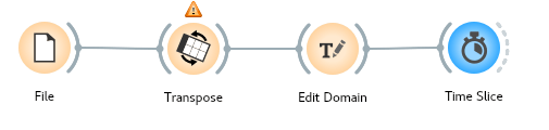
We'll be using a special widget from Orange3-Timeseries: Time Slice, which lets you select data in a time window. It also features a playback function that slowly moves the time window, outputting corresponding data as it goes.
Transpose: part I
Time Slice requires time instances in the form of rows, while our data specifies them in columns. Let's start again with the File widget that loads the data. Move Lat and Long to meta attributes by double-clicking feature in the Role column and selecting meta. This will tell Orange to exclude them from data manipulations.
To flip rows and columns, we use the Transpose widget. Connect it to the File widget.
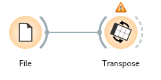
Set From variable to Country/Region. Ignore the warning that indices were added to variables with the same name; it won't hurt us.
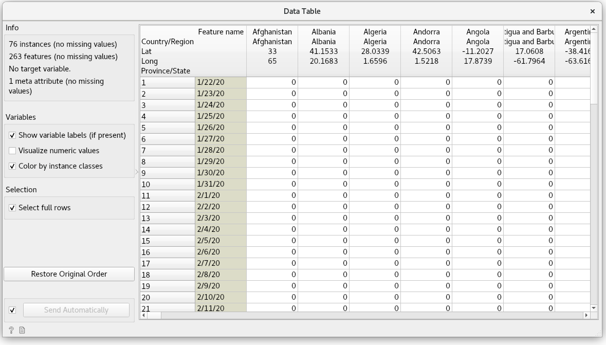
To better understand what just happened, connect a Data Table to Transpose and see the result: rows and columns were swapped. Columns are named after countries (because we chose Country/Region in the Transpose widget), while a new column, Feature name, contains the original names of the columns.
Right now, Orange is treating values in Feature name as strings. We need to tell Orange that the feature contains timestamps. Let's connect an Edit Domain widget.
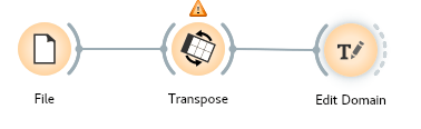
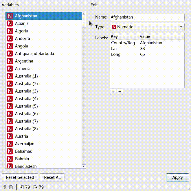
Scroll to the bottom of Variables and select Feature name. In Edit, change its type to Time. While you're at it, change its name to something meaningful, like date. Finally, click Apply
The data is now ready to be processed by Time Slice.
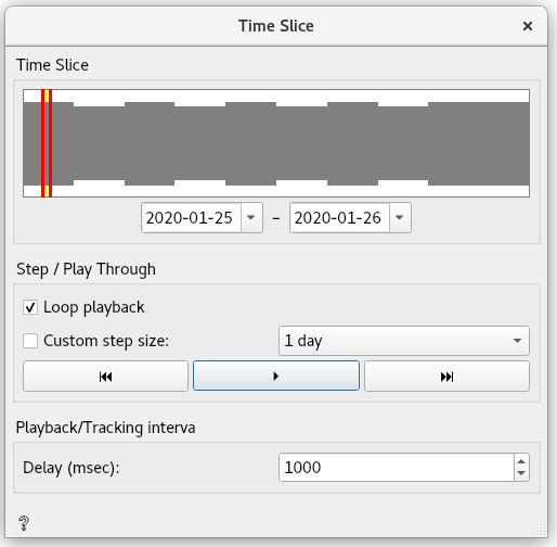
The top indicates the currently selected slice of data. You can change the interval by interacting with the histogram, or by adjusting the start and end dates directly below. Let's select a day's slice between the 25th and 26th January 2020.
With a click of the play button, the slice moves, and the data output updates accordingly. To verify that it works, connect a Data Table, and see it in action.
Transpose: part II
Make sure to stop the Time Slice playback before proceeding. We're almost at the finish line; we just need to transform the data back into its original form. To do so, connect another Transpose widget.
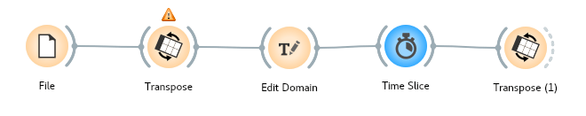
Under Future names select Generic, which will name the new column Feature 1.
Let's connect a Data Table for a final check of our data before putting it on a map.
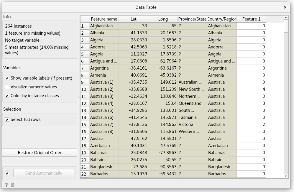
Looking good!
The final step entails connecting the Choropleth Map, selecting Feature 1 as Attribute, and Sum as the Agg.
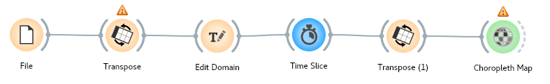
To observe the animation, open up both Choropleth and Time Slice at the same time.
Protip: pressing Ctrl/CMD+Up reveals the workflow, Ctrl/CMD+Down reveals widget windows.
All that's left is to hit play.
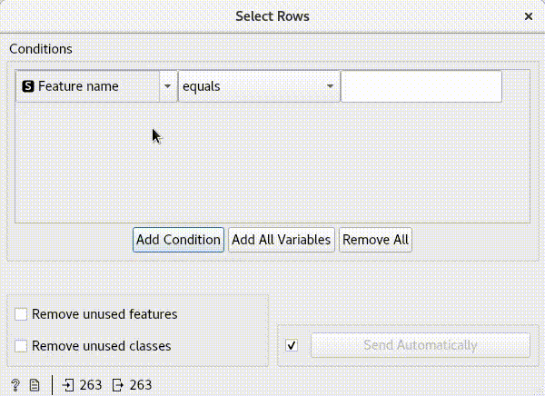
Now that we're familiar with Time Slice, let's use it with Geo Map too. For bonus points, let's also remove countries with zero confirmed cases. That way, the number of points on the map will increase as the virus spreads throughout the world. For this, we'll use a Select Rows widget.
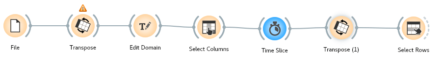
Under Conditions, select Feature 1, select is greater than, and type in 0.
Add and connect a Geo Map widget. Zoom out, so you see the whole world, and on the left side, check Freeze map. This will prevented the map from jumping around as new points are added.
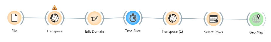
Press play once again – let's see what we've built!
Where from here?
In the blog, we explained how to turn Orange into an interactive data exploration tool for COVID-19 data! With a few widgets we were able to determine the change in time for the confirmed cases and plot the results on a map.
Time Slice isn't the only widget in the Orange3-Timeseries add-on. Stay tuned for next week's blog, where we'll delve deeper into the patterns emerging from time-series data.
Orange is a multi-platform open-source machine learning and data visualization tool for beginners and experts alike. Download Orange, and load and explore your own data sets!
In addition to a variety of learning materials posted online in the form of blog posts, tutorial videos, we've created a Discord server. Join the community, tell us what you think!