covid-19, feature construction, line plot
Data Mining COVID-19 Epidemics: Part 1
Janez Demšar
Apr 02, 2020
These days we are all following the statistics of COVID-19, looking at how our own country is faring and how it's comparing with other countries. Luckily, only a few have a statistically meaningful number of deaths (which solemnly reminds us of the difference between statistical and practical significance!), so we concentrate on the number of confirmed cases.
You're reading the first and most basic blog post from a series in which we will investigate this data using Orange. Most people are capable of doing something in Excel(-like programs), and some can do everything in Python with pandas and jupyter. I'll show you how many people can do many things in Orange.
Today, we will see how to get this data into Orange, draw some basic curves, and relate it to other data sources. Don't expect anything dramatic; this will be more about showing some creative ways of connecting a few widgets, and starting to explore the data about COVID-19 epidemics.
Getting the data
John Hopkins University collated some COVID-19 information in a machine-readable format and published it on Github. We will examine the table with confirmed cases by regions and countries.
To get the numbers behind the above table, click "Raw". Or this link: https://raw.githubusercontent.com/CSSEGISandData/COVID-19/master/csse_covid_19_data/csse_covid_19_time_series/time_series_covid19_confirmed_global.csv. Save the page and you'll have a file to play with.

Easier still, Orange's File widget can load the data directly from the web, and handles a basic .csv file (for more fine-grained options, use CSV File Import).
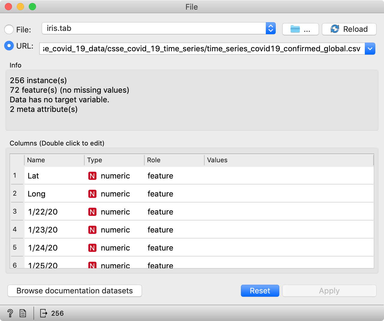
So, for starters, add the File widget to the canvas and copy the above link to the URL field. You can then connect it to a Data Table widget and check that everything's loaded OK. You should see a table with rows corresponding to regions and countries, and columns corresponding to dates, with two additional columns detailing region locations (latitude, longitude).
Note that this is live data, so your results will differ from those we show here.
Plot the usual plots

Connect the File to a Line Plot widget to see the graph. By default, Line Plot shows means and ranges, while we are interested in raw lines. Let's click the checkboxes accordingly.
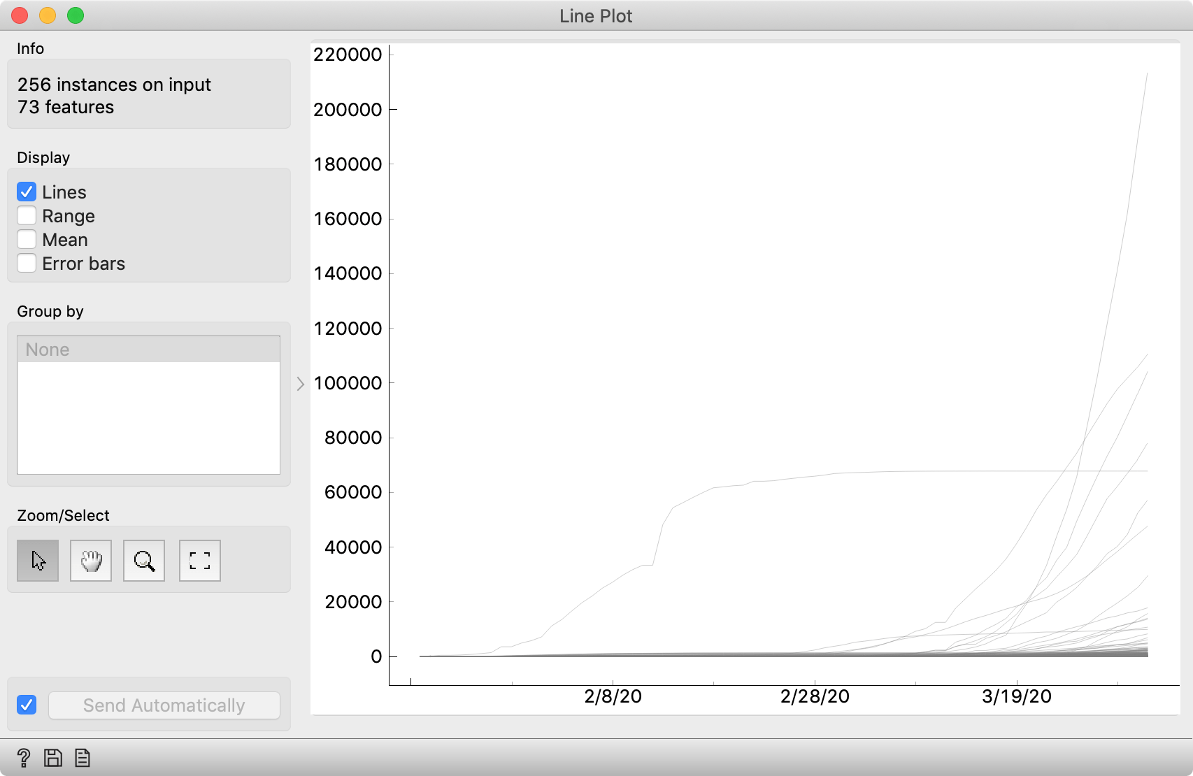
Pretty boring. Anybody can do this in Excel. Orange allows us to play with these curves, though.
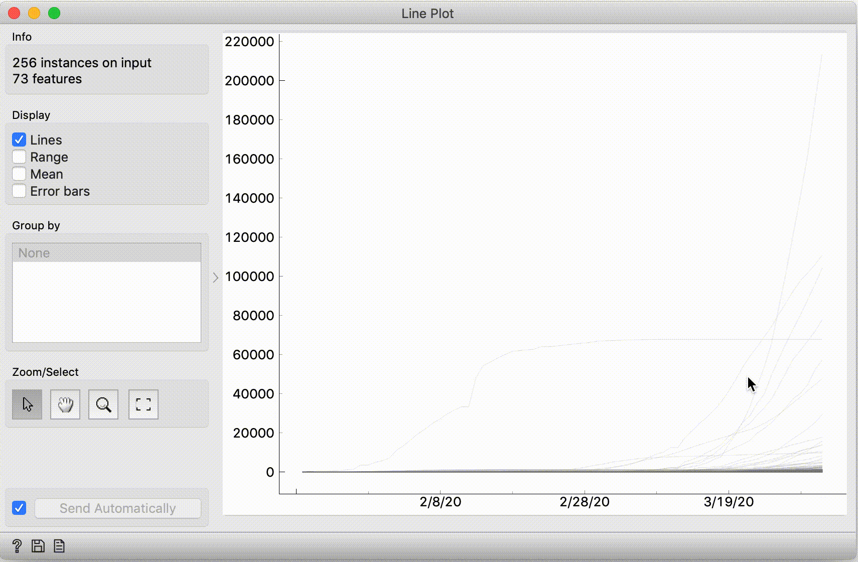
The curve that grows rapidly but then flattens out -- is probably China, right? To check this, select it. It may be hard to click the curve, so select it by dragging a line across it.

Then, connect the Line Plot widget to Data Table, and it will show the data for this curve. You'll learn that this is, of course, the Hubei province – where it all started.
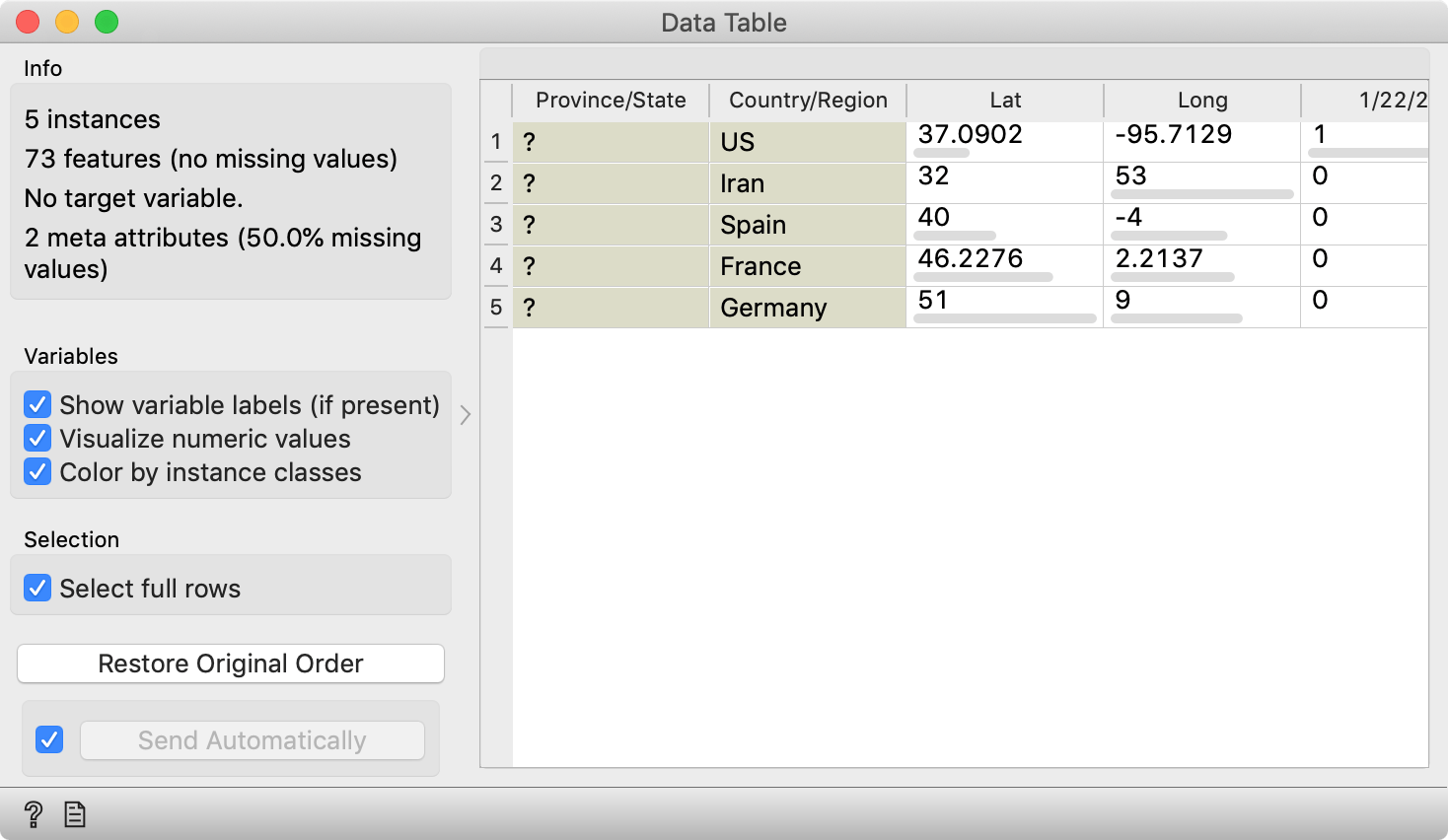
What are the fast-rising curves? Select them by dragging a line across them, and check the Data Table widget: these are the US, Iran, Italy, Spain, Germany and France.
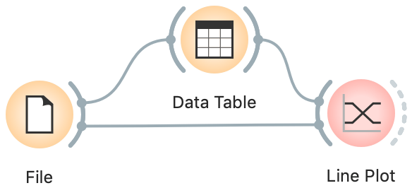
We can do it the other way around: connect File to Data Table and Data Table to Line Plot, such that the Data Table sends its selected subset of data.
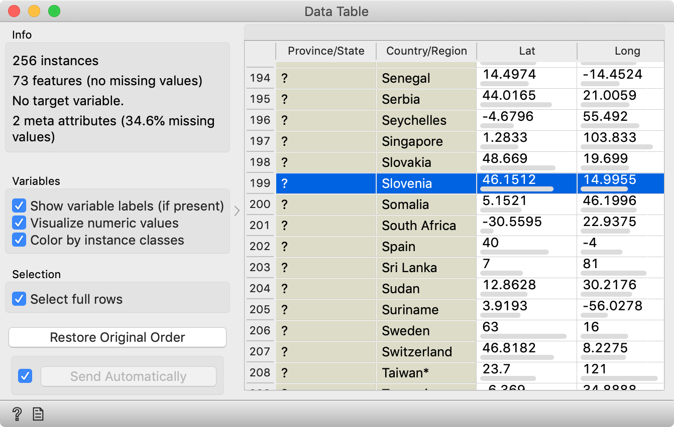
In the Data Table, you can now find and click your favourite country. Line Plot will now highlight the curve for Slovenia (or whichever country you chose). You can also select multiple countries, like all the Chinese provinces. Or all European countries.
Well, the latter is a bit difficult; there is no data about the continent. There's a trick, though.
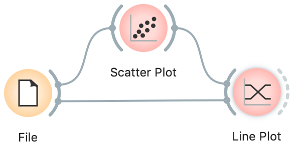
Replace the Data Table widget with a Scatter Plot widget, and choose Long and Lat for x and y respectively. Zoom in on Europe and select the points by dragging across them. Line Plot will highlight the curves belonging to the countries chosen in the Scatter Plot.
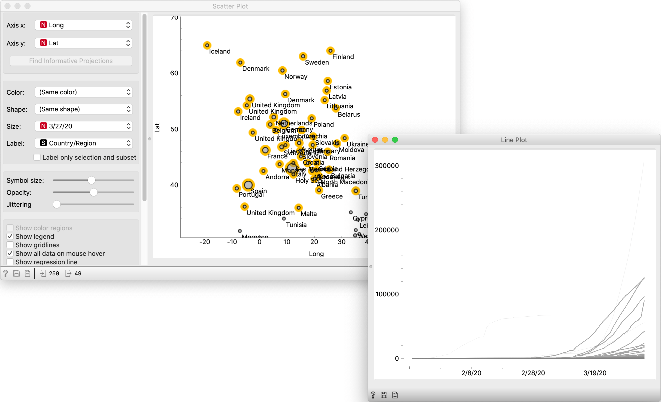
In the case of Slovenia (and possibly your choice as well), we couldn't really see its curve because it's negligent in comparison with others. The only thing we've learned is that the 327-million-man US have more cases of COVID-19 than a 2-million-man Slovenia. The same goes for Chinese provinces: the only one that sticks out is Hubei. Also, the "map" we improvised in Scatter Plot was a poor-man's map. Orange has proper geographical support (Orange3-Geo add-on), we'll look at it in-depth in a follow-up post.
The message here regards the essential difference between plotting curves and real data mining: static curves are dead; data mining is interactive.
Connecting data sets
Let's solve the problem of negligible curves for small countries. This is not just about populations: the biggest problem is that confirmed cases are the result of testing, and testing strategies vary by country. Icelanders and Koreans test like crazy, while the number of tests in the US was (initially) so small it was comparable to that of Slovenia (and with it, the number of confirmed cases). The number of tests could thus normalize the number of confirmed cases, but this wouldn't do either; the testing isn't equivalent – some countries test more at random, while others save tests for groups at greater risk. And regardless, exact data about the number of tests is not readily available.
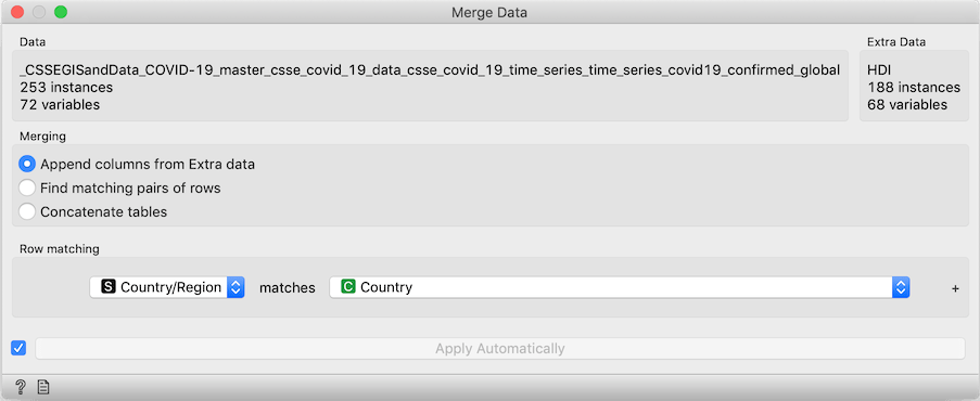
So, let's fallback to the number of cases per million inhabitants. Neither this nor the population of countries are present in the data provided by John Hopkins University. We do, however, have another data set at arm's reach: the population of countries (for year 2015) appears in the Worldbank's Human development index (HDI) data.
To load it, use the Datasets widget, find and double-click the HDI data set.
Now we're working with two data sets.
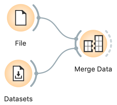
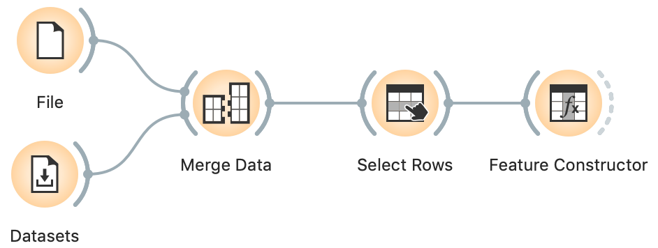
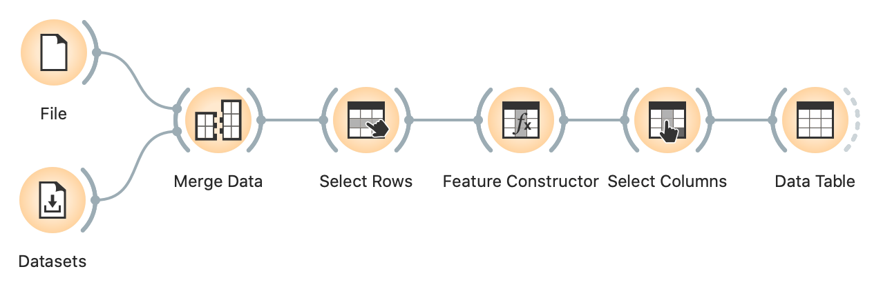
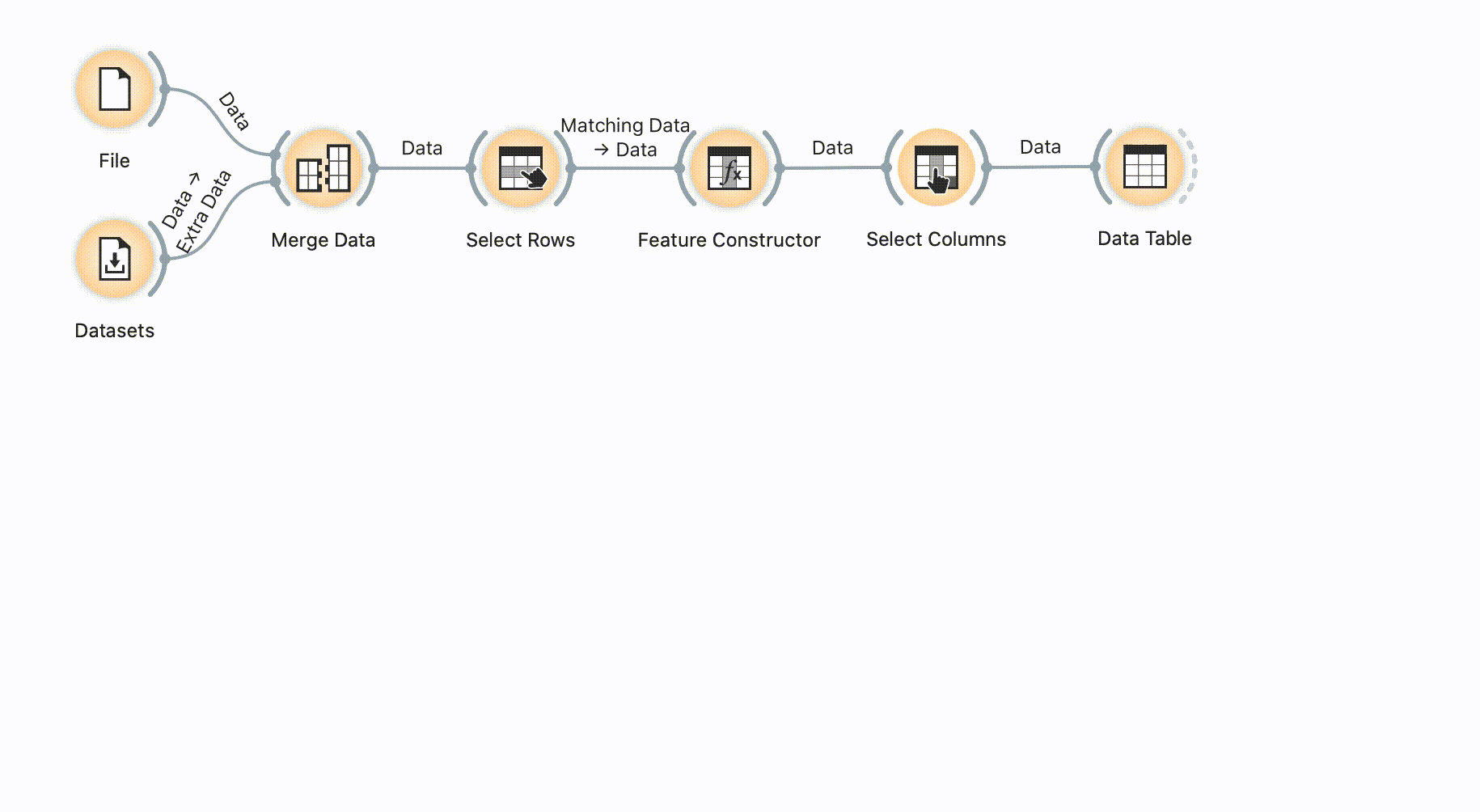
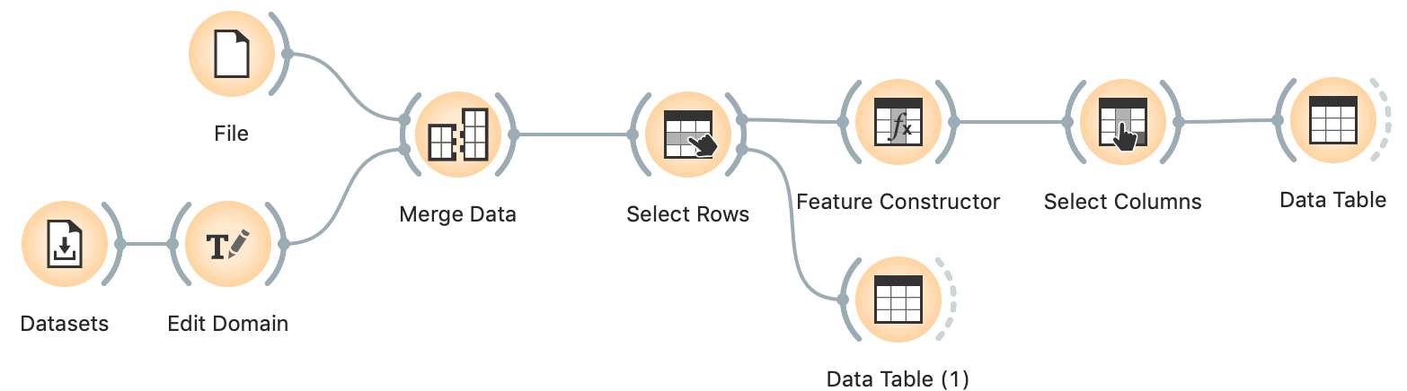
Let's merge them using the Merge Data widget: connect both the File widget (with the John Hopkins data), and the Datasets widget (with the HDI data) to Merge Data. Make sure to match the "Country/Region" feature in COVID-19 data with the "Country" feature in HDI. It is also important to connect the widgets in this order, so File provides the main data and the Datasets widget augments it with additional annotation columns. If you do it incorrectly, double-click the connections to fix it.
The match is imperfect: some countries appear with different names, for instance, "Russia" from John Hopkins doesn't match the "Russian Federation" from HDI, and the John Hopkin's "US" and doesn't match HDI's "United States".
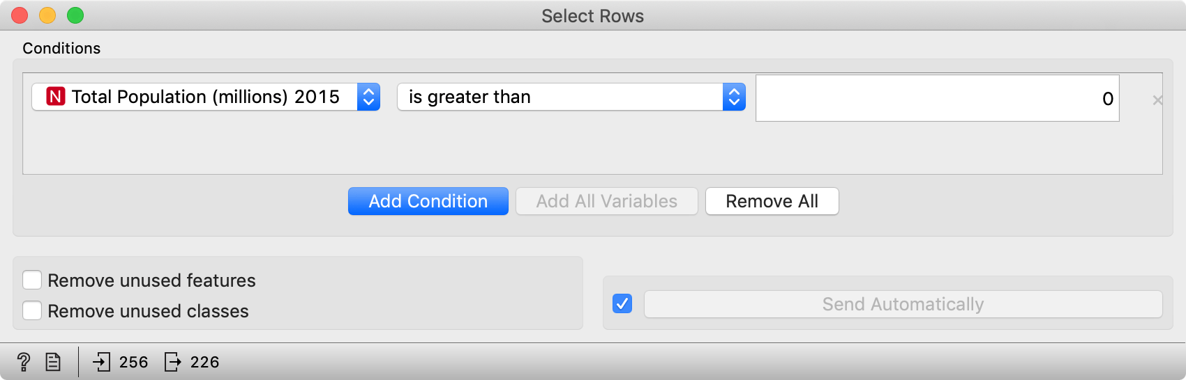
The population of Liechtenstein in millions with one decimal is 0.0; similar for Palau.
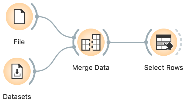
To remove countries with unknown or zero population, we continue with Select Rows, where we set the condition "Total Population (millions) 2015 is greater than 0".
Now for some constructive business.
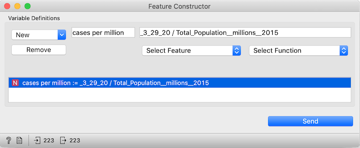
To get the number of cases on some particular day, we use the Feature Constructor widget, where we can input a formula to compute new data columns. In "New" we select Numeric, type cases per million as the name of the new column, Select Feature "3_29_20" (or whichever date we'd like), add /, and then select "Total_Population__millions__2015".
As a shortcut, you can just copy _3_29_20 / Total_Population__millions__2015 into the "Expression..." line. (Note that an underscore precedes 3_29_20: this way Orange knows that this is not a number but a name of a column.)
Things got crowded, so perhaps we can remove some columns.
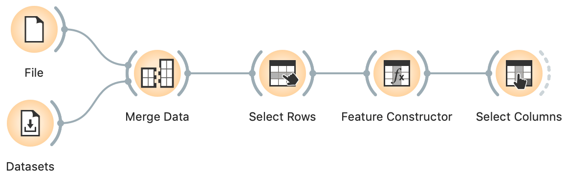
We add Select Columns, open it, and remove all columns we don't need right now. We can just select all features (Ctrl-A or Cmd-A) and drag them to the left, and then drag "cases per million" back to features.
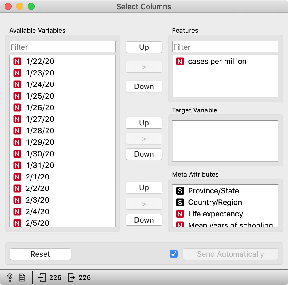
Finally, add and connect a Data Table.
Sort by the last column and, voilá, you've ranked countries the number of cases per a million inhabitants.
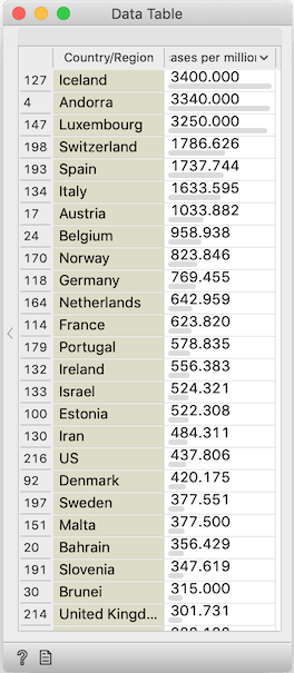
Missing in action: China. The data for China is split into provinces, yet every row is divided by the country's entire population. France seems to have a similar problem: it is given as a single country, but followed by external territories whose numbers are divided by the entire population. Also missing in action: Russia / Russian Federation, and US / United States, as we've previously explained.
Fixing these glitches will require some manual work.
Editing the data
To fix the non-unique country names, we could open one of the two files in Excel and fix discrepancies, but there's no need for it: this is easier done in Orange, which will help us identify the missing countries. They are removed in the Select Rows widget. We hence connect a Data Table to Select Rows, double click the connection and do some editing: click the line between Matching Data and Data to remove it, and drag a line from Unmatched Data to Data.
This way, we can see which countries were filtered out. They seem to be absent due to either not being present in HDI, or having too small of a population.
Let's insert an Edit Domain widget between the Datasets widget and Merge Data.
We find and select column Country. Now change its type from Text to Categorical. Note, this is conceptually wrong: "Country" is a text variable, it contains a name and not a "category" of country, like the continent or the direction of writing. However, Edit Domain only lets us map its values if we change it to Categorical. And having it as categorical won't hurt.
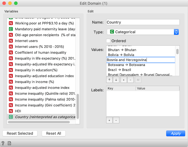
After changing the variable type, the widget will show another box, Values, with a mapping of values. Let's look at the countries in the new excluded rows Data Table widget. We see, for instance, "Bosnia and Herzegovina". We need to match to how John Hopkins data refers to countries, so go back to Edit Domain, and find "Bosnia and Herz.". Double click it and change it to "Bosnia and Herzegovina".
Similarly, Czech Rep. should become Czechia, Macedonia is now officially North Macedonia, Russian Federation is Russia, United States is US and Viet Nam is Vietnam. John Hopkins has "Korea, South" and HDI includes just Korea. Based on its high human development index and GDP, we can safely assume that this is the northern one. (Kidding, map this Korea to Korea, South, of course. There's no virus in the other Korea because Kim anticipated it before it even appeared and already invented a cure long ago.)
Now that I've taught you how to fish, I give you a fish for today: after editing these and all the other countries whose matches I found, I saved it to a file you can download and use. Replace the Datasets widget with a File, and load it.
Analysis beyond population
Comparing this data with the World Bank's data is great because it allows us to relate the epidemiological data to data about particular countries.
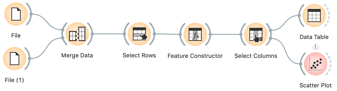
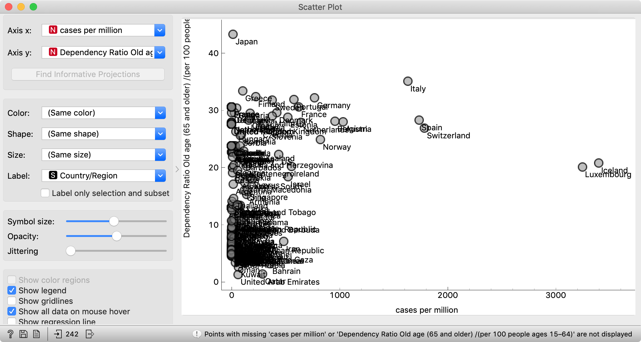
In Select Columns, we removed most of the features. Bring back all those that come from HDI. Now connect, say, a Scatter Plot and observe the relation between the number of cases per million and the number of physicians per ten thousand, which is the closest approximation to the capabilities of health systems.
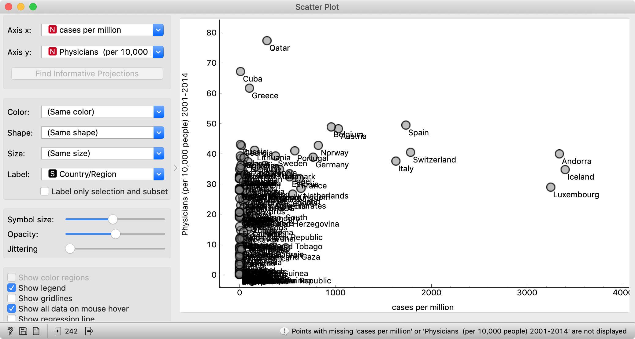
The conclusion here would be that you may want to find yourself in Qatar, Cuba or Greece right now. People are often surprised to see Cuba in such contexts, though Cuba has an excellent public health system and pretty good (though perhaps not entirely unbiased) free education. Seeing this graph, it shouldn't come as a surprise that Cuban doctors are heading to Italy and other countries to help fight the epidemics.
A seemingly related measure, Public health expenditure doesn't work here. It is expressed as a percentage of GDP, so it is adjusted for physicians' salaries, but not necessarily for the prices of (imported) equipment. Furthermore, higher spending may reflect a more expensive but not necessarily a more efficient health system.
Another potentially interesting factor to follow will be the age of the population. HDI tells us the number of people older than 65 years per 100 people between 15 and 64.
I should have used future tense; the population age will be interesting to observe with respect to mortality rate, but not enough countries have a sufficient number of deaths. Let's hope it stays this way.
We will eventually be able to (or -- let's hope we won't) explore the relations between epidemics and other sociodemographic data. Generally, the problem with analyzing this data per country is currently that the disease has mostly spread (or been detected?) in developed countries, resulting in many correlations like the speed of spreading and percentage of urban populations, which may or may not reflect actual causation.
Back to curves
What about curves showing the number of confirmed cases per million? We computed the cases per million for a single day, not for all days. While Orange is a general-purpose data mining tool, some operations are too specific to be implemented in widgets. For such cases, we can program some processing in Python, using the Python Script widget.
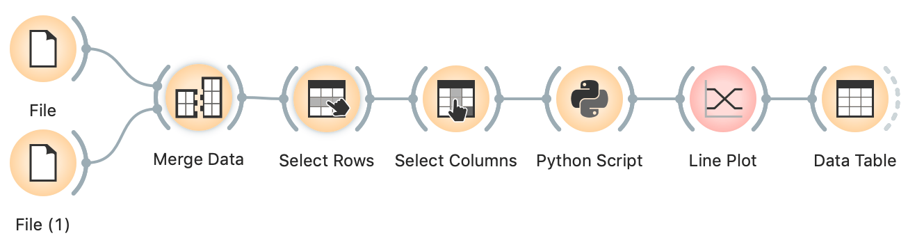
The start of the sequence is the same as before: we merge the two data sources and remove countries with unknown or zero population.
In Select Columns, we move all variables except daily data from features to metas.
In Python Script, we type the following program and run it:
import numpy as np
import Orange

normalized = in_data.X / in_data[:, "Total Population (millions) 2015"].metas

out_data = Orange.data.Table.from_numpy(
    in_data.domain,
    normalized, in_data.Y, in_data.metas)
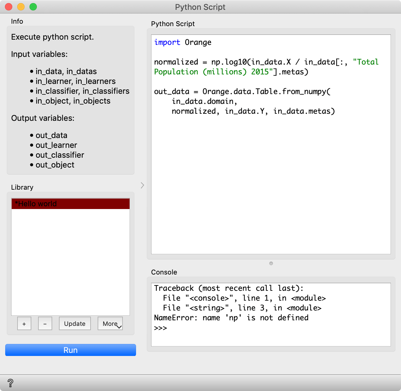
With in_data[:, "Total Population (millions) 2015"] we take the table corresponding to the column with the population. Since population is now a meta attribute, we take .metas. We divide in_data.X with this column. Finally, we construct a new table named out_data, with the same domain (that is, the same variables), the normalized data, and the original data for target variable(s) and metas.
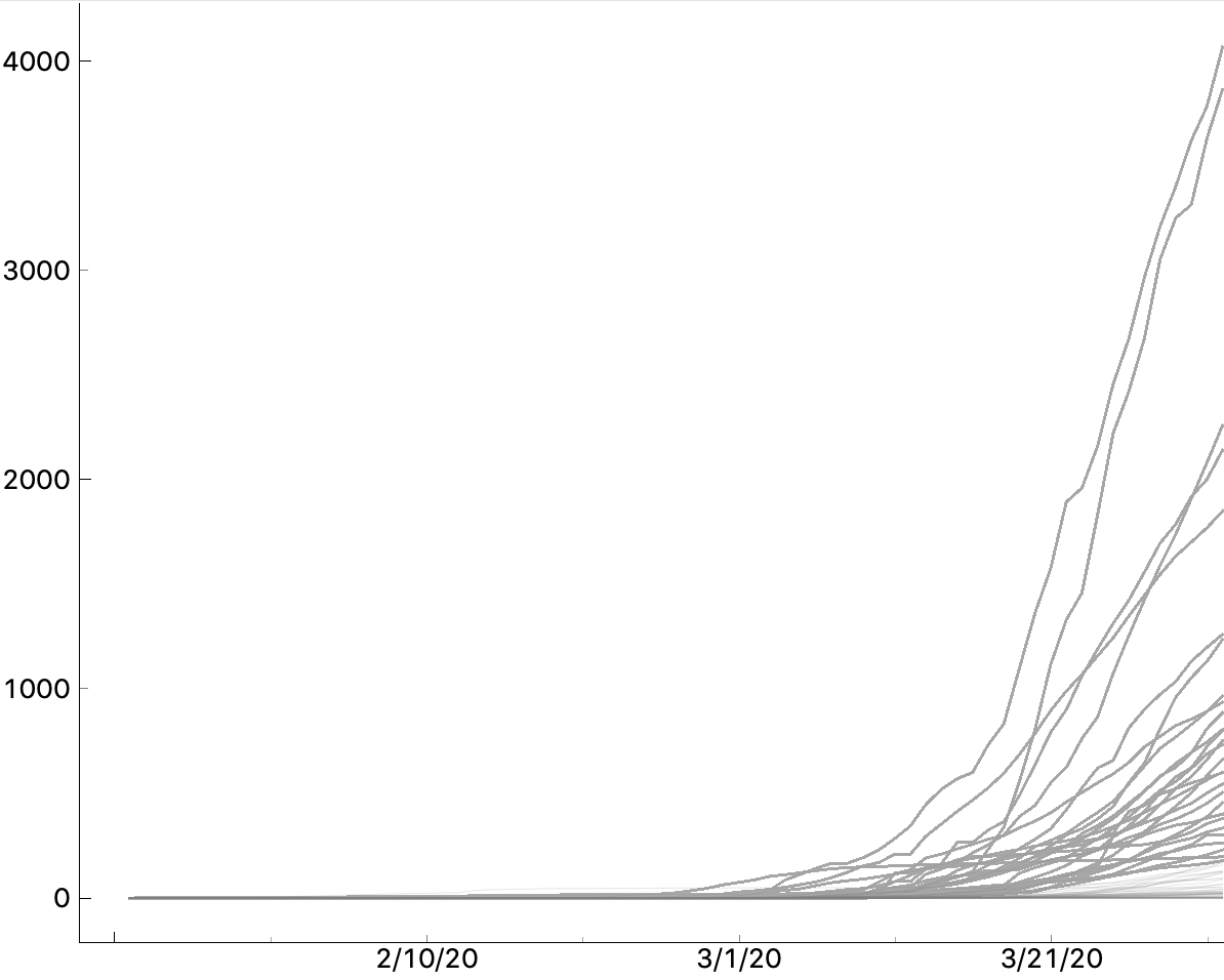
We get a similar line plot as before, just with proper scale. Observe it. There are two countries with 3000-4000 confirmed cases per million?! Which? Check yourself!
Would you like to see a plot with a logarithmic axis? And Line Plot doesn't support it? (Yet?) The beauty of using the Python script widget is that we can transform the data any way we want. Change the line that computes the normalized data to
normalized = np.log10(in_data.X / in_data[:, "Total Population (millions) 2015"].metas)
And we have a logarithmic axis (just with wrong labels).
Where from here?
This data is related to countries. Hence it would be nice to put it on a map. It also deals with time, and core Orange is not well-equipped for it. In the two follow-up posts, we will explore the add-ons for geographical data and for time series.
Orange is a multi-platform open-source machine learning and data visualization tool for beginners and experts alike. Download Orange, and load and explore your own data sets!
In addition to a variety of learning materials posted online in the form of blog posts, tutorial videos, we've created a Discord server. Join the community, tell us what you think!