bioinformatics, gene expression, line plot
Gene Expression Profiles with Line Plot
Ajda Pretnar
Jun 03, 2019
Line Plot is one of our recent additions to the visualization widgets. It shows data profiles, meaning it plots values for all features in the data set. Each data instance in a line plot is a line or a 'profile'.
The widget can show four types of information – individual data profiles (lines), data range, mean profile and error bars. It has the same cool features of other Orange visualizations – it is interactive, meaning you can select a subset of data instances from the plot, it allows grouping by a discrete variable, and it highlights an incoming data subset.
Related: Scatter Plot: The Tour
Let us check a simple example. We will use brown-selected data, which is a data on gene expression of baker's yeast. To observe gene expression profiles, we will use Line Plot.
\
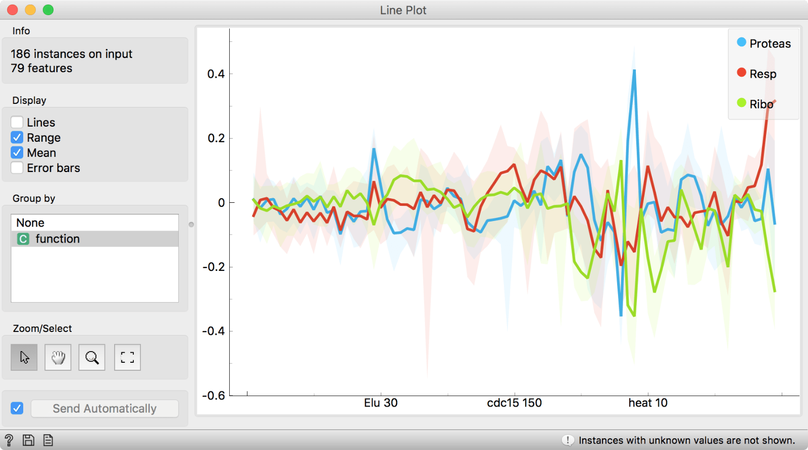
\
Since the data has class, which represents a function of the gene, Line Plot will automatically group by class variable. It seems like protease, respiratory and ribosome genes have quite distinctive profiles! Let us select the most interesting region in the plot by selecting the zoom tool and dragging across the area of interest.
\
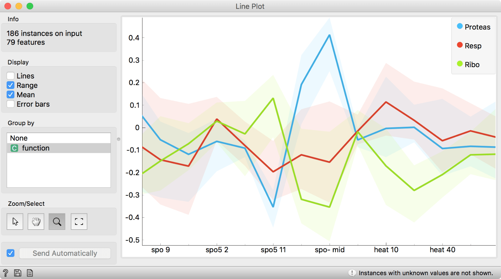
\
We see that spo-mid feature distinguishes really well between protease and two other gene types and that values of protease are normally high for spo-mid.
Another thing we can do is select a subset from the plot. If we press the ‘rectangle’ icon on the left, our plot will be automatically resized to the original size. Then we press the ‘arrow’ icon, which will put us back to the selecting mode. Now let us select Lines instead of Range and Mean for display. This will show individual expression profiles.
\
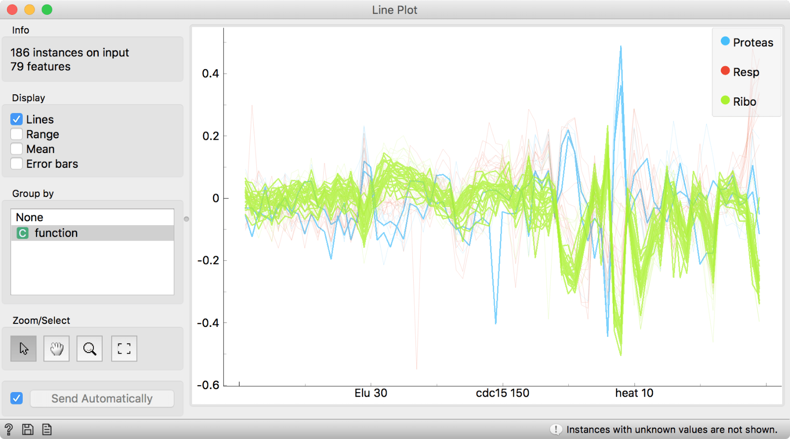
\
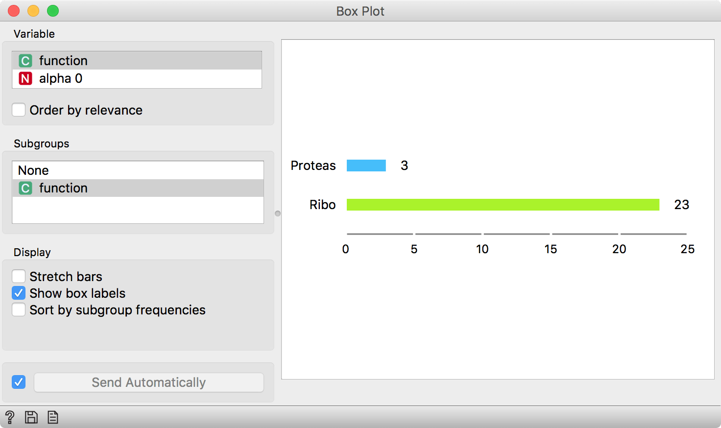
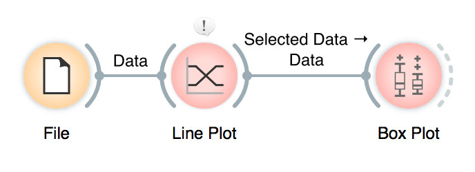
If we click and drag across an area of interest, instances under the thick black line will be selected. We can connect, say a Box Plot to the Line Plot and observe the distribution of the selected subset. Unsurprisingly, the genes we have selected are mostly protease.
\
\
\
This is it. Line Plot is really simple to use and can reveal many interesting things not only for biologists, but for any kind of data analyst. Next week we will talk about how to work with timeseries data in combination with the Line Plot.