analysis, clustering, data, dataloading, orange3, visualization, workshop
Analyzing Surveys
AJDA
Oct 26, 2017
Our streak of workshops continues. This time we taught professionals from public administration how they can leverage data analytics and machine learning to retrieve interesting information from surveys. Thanks to the Ministry of Public Administration, this is only the first in a line of workshops on data science we are preparing for public sector employees.

For this purpose, we have designed EnKlik Anketa widget, which you can find in Prototypes add-on. The widget reads data from a Slovenian online survey service OneClick Survey and imports the results directly into Orange.
We have prepared a test survey, which you can import by entering a public link to data into the widget. Here's the link: https://www.1ka.si/podatki/141025/72F5B3CC/ . Copy it into the Public link URL line in the widget. Once you press Enter, the widget loads the data and displays retrieved features, just like the File widget.
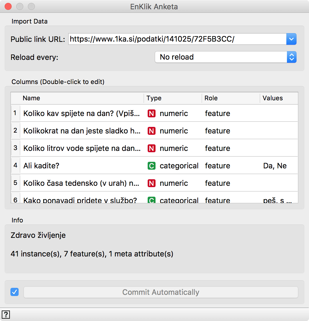 EnKlik Anketa widget is similar to the File widget. It also enables changing the attribute type and role.
The survey is in Slovenian, but we can use Edit Domain to turn feature names into English equivalent.
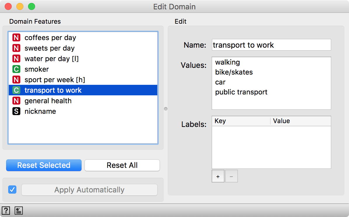
We renamed attributes in order as they appear in the survey. If you load the survey yourself, you can rename them just like you see here.
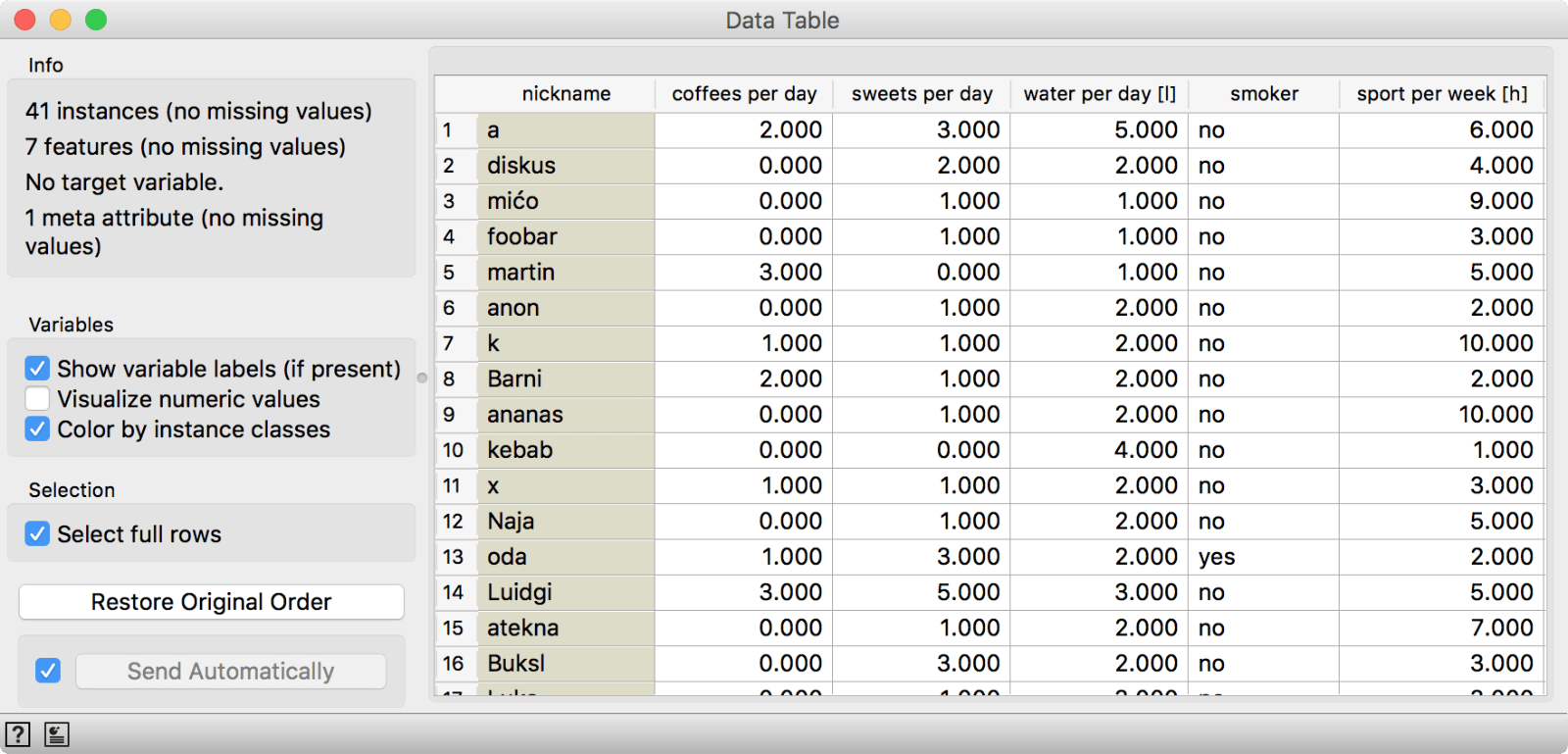
As always, we can check the data in a Data Table. We have 41 respondents and 7 questions. Each respondent chose a nickname, which makes it easier to browse the data.
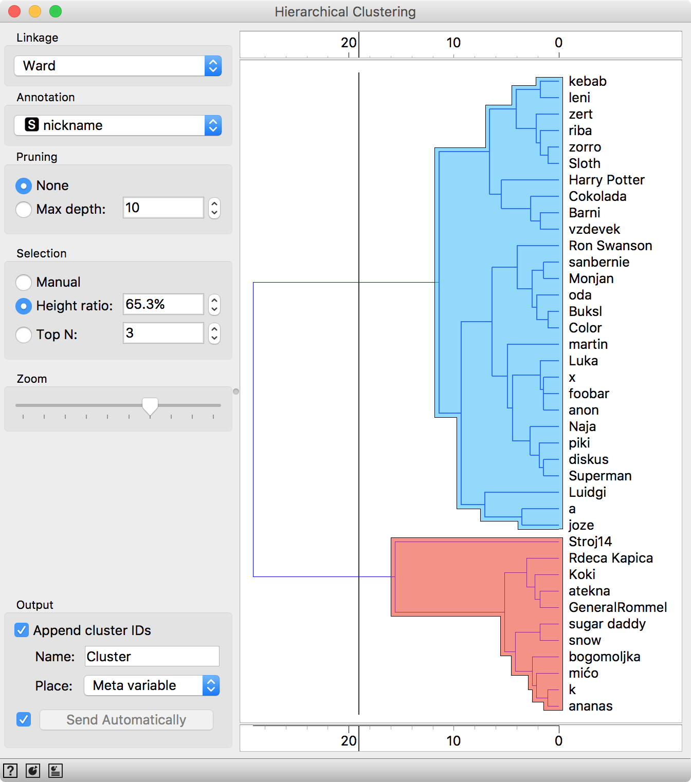
Now we can perform familiar clustering to uncover interesting groups in our data. Connect Distances to Edit Domain and Hierarchical Clustering to Distances.
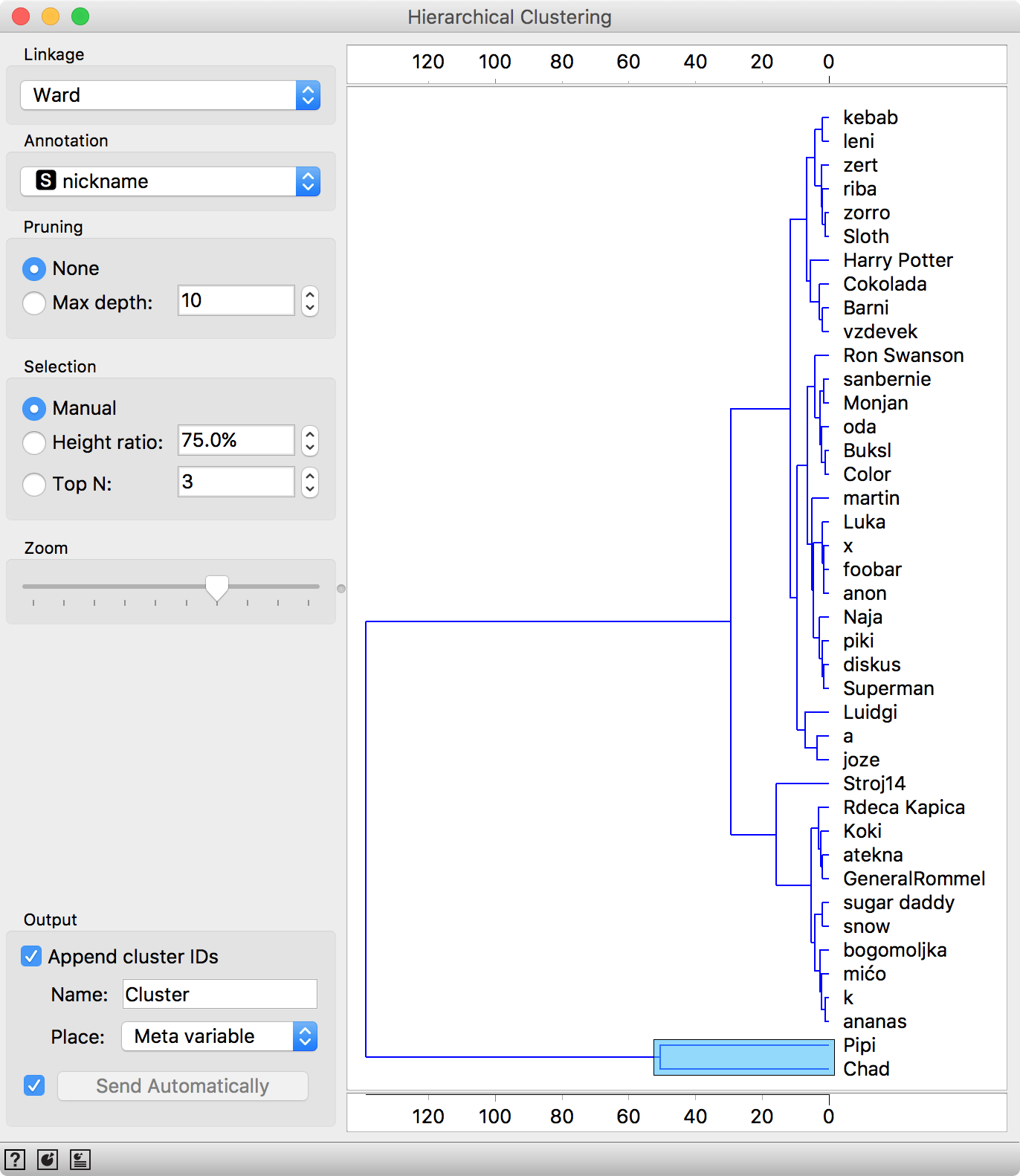
Distance from Pipi and Chad to other respondents is very high, which makes them complete outliers.
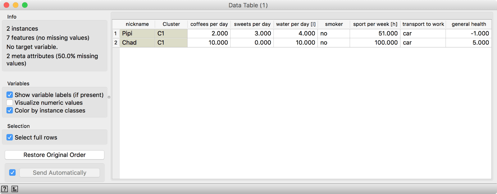
We have two outliers, Pipi and Chad. One is an excessive sportsman (100 h of sport per week) and the other terminally ill (general health -1). Or perhaps they both simply didn't fill out the survey correctly. If we use the Data Table to filter out Pipi and Chad, we get a fairly good clustering.
We can use Box Plot, to observe what makes each cluster special. Connect Box Plot to Hierarchical Clustering (with the two groups selected), select grouping by_ Cluster_ and tick Order by relevance.
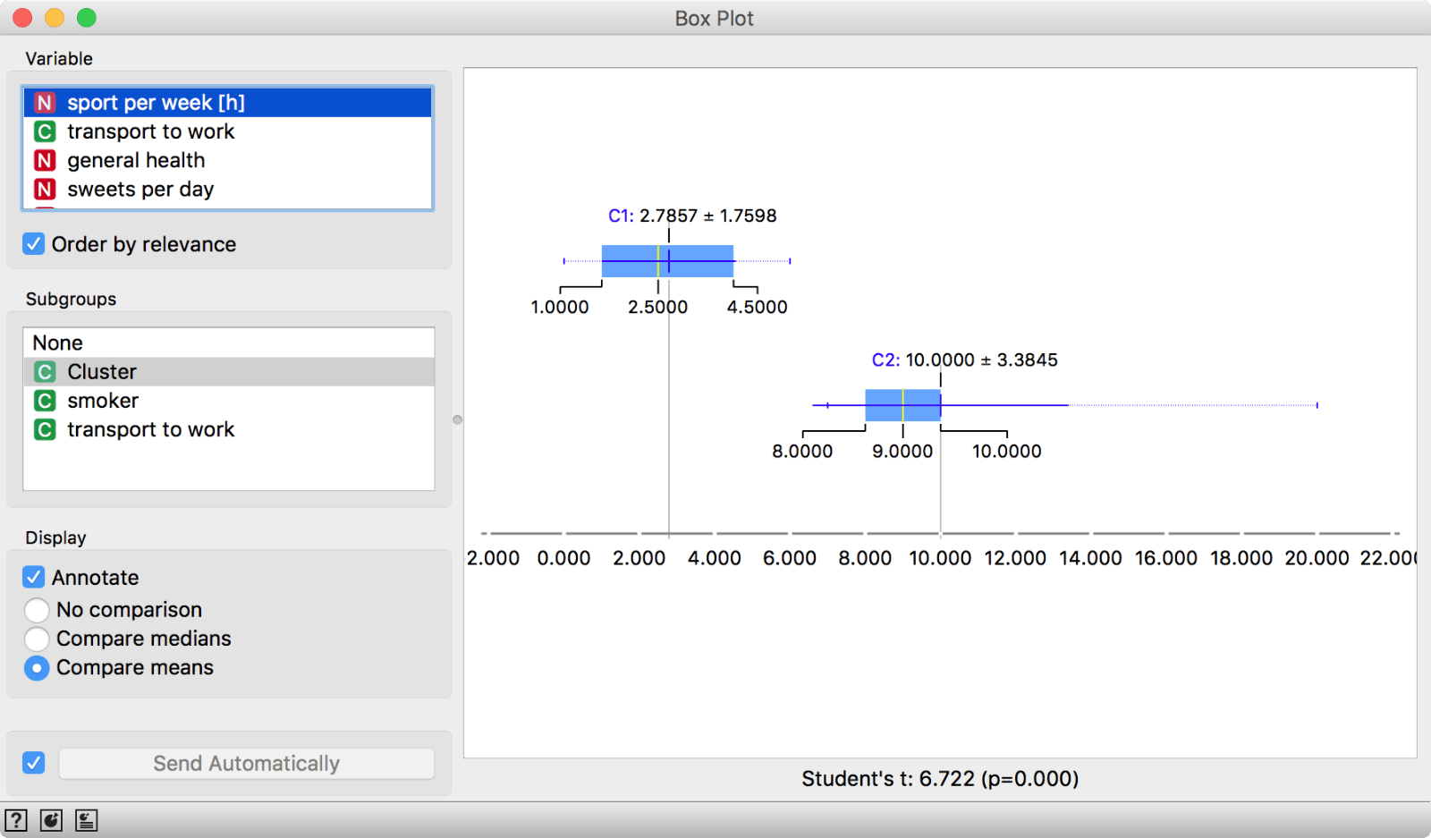 Box Plot separates distributions by Cluster and orders attributes by how well they split selected subgroups.

The final workflow.
Seems like our second cluster (C2) is the sporty one. If we are serving in the public administration, perhaps we can design initiatives targeting cluster C1 to do more sports. It is so easy to analyze the data in Orange!