documentation, education, features, interface, orange3
10 Tips and Tricks for Using Orange
AJDA
Oct 17, 2016
TIP #1: Follow tutorials and example workflows to get started.
It's difficult to start using new software. Where does one start, especially a total novice in data mining? For this exact reason we've prepared Getting Started With Orange - YouTube tutorials for complete beginners. Example workflows on the other hand can be accessed via Help - Examples.
TIP #2: Make use of Orange documentation.
You can access it in three ways:
- Press F1 when the widget is selected. This will open help screen.
- Select Widget - Help when the widget is selected. It works the same as above.
- Visit online documentation.
TIP #3:** Embed your help screen.**
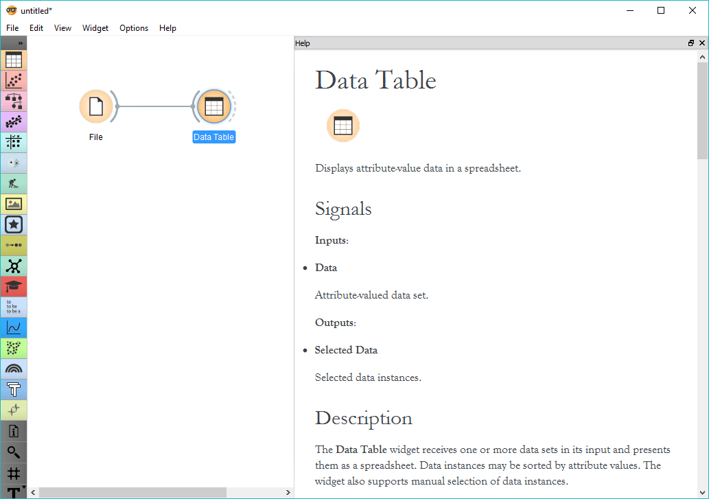
Drag and drop help screen to the side of your Orange canvas. It will become embedded in the canvas. You can also make it narrower, allowing for a full-size analysis while exploring the docs.
TIP #4: Use right-click.
Right-click on the canvas and a widget menu will appear. Start typing the widget you're looking for and press Enter when the widget becomes the top widget. This will place the widget onto the canvas immediately. You can also navigate the menu with up and down.
TIP #5: Turn off channel names.
Sometimes it is annoying to see channel names above widget links. If you're already comfortable using Orange, you can turn them off in Options - Settings. Turn off 'Show channel names between widgets'.
TIP #6: Hide control pane.
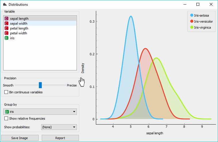
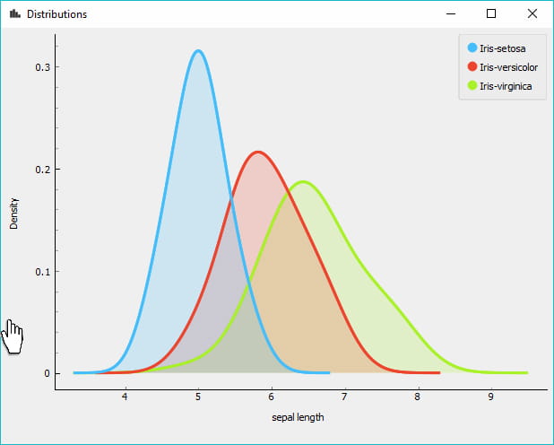
Once you've set the parameters, you'd probably want to focus just on visualizations. There's a simple way to do this in Orange. Click on the split between the control pane and visualization pane - you should see a hand appearing instead of a cursor. Click and observe how the control pane gets hidden away neatly. To make it reappear, click the split again.
TIP #7: Label your data.
So you've plotted your data, but have no idea what you're seeing. Use annotation! In some widgets you will see a drop-down menu called Annotation, while in others it will be called a Label. This will mark your data points with suitable labels, making your MDS plots and Scatter Plots much more informative. Scatter Plot also enables you to label only selected points for better clarity.
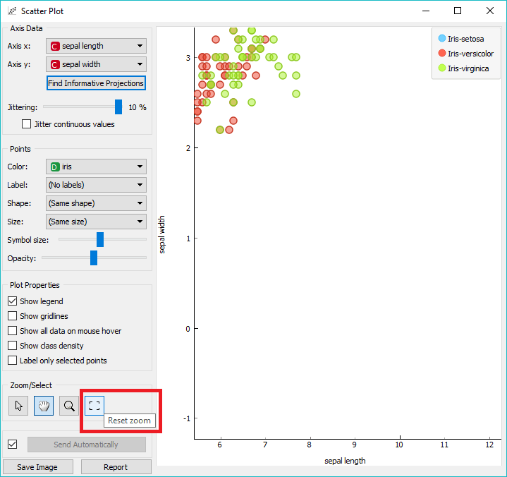
TIP #8: Find your plot.
Scrolled around and lost the plot? Zoomed in too much? To re-position the plot click 'Reset zoom' and the visualization will jump snugly into the visualization pane. Comes in handy when browsing the subsets and trying to see the bigger picture every now and then.
TIP #9: Reset widget settings.
Orange is geared to remember your last settings, thus assisting you in a rapid analysis. However, sometimes you need to start anew. Go to Options - Reset widget settings... and restart Orange. This will return Orange to its original state.
TIP #10: Use Educational add-on.
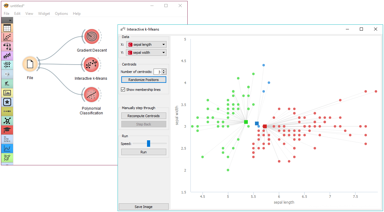
To learn about how some algorithms work, use Orange3-Educational add-on. It contains 4 widgets that will help you get behind the scenes of some famous algorithms. And since they're interactive, they're also a lot of fun!
