clustering, explanation, box plot
Characterizing Clusters with a Box Plot
Blaž Zupan
Oct 21, 2021
There are many ways to cluster the data in Orange. Hiearchical clustering, k-means, and DBSCAN are just few of the widgets we can use to find groups of data instances with similar values of attributes. Once we infer the clusters, we need to analyze them to determine their characterizing features. It is there that actually the fun begins.
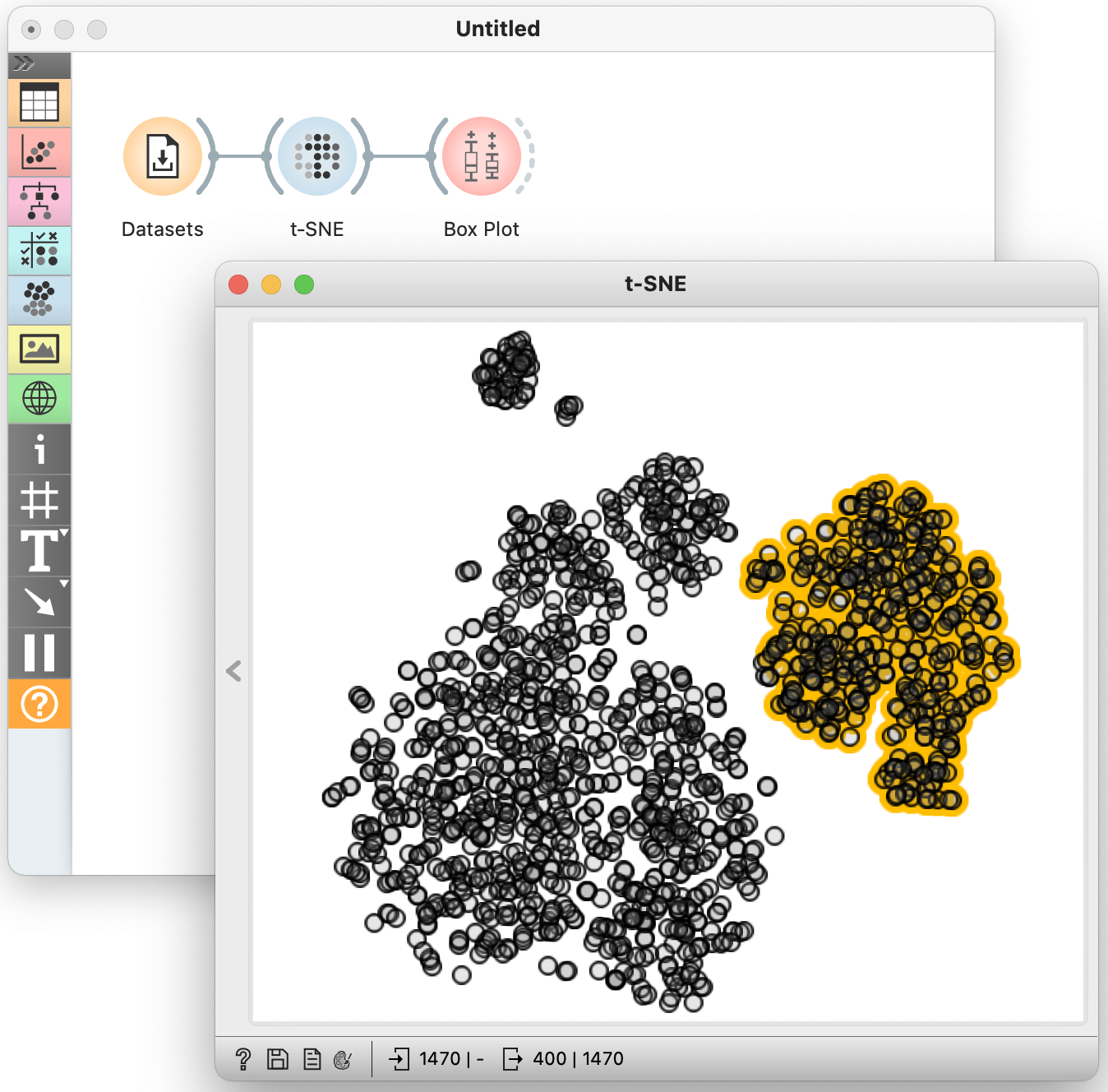
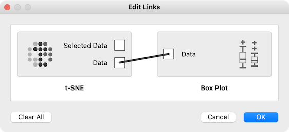
Out of many ways for cluster analysis, perhaps the simplest one is by using the Box Plot. Consider the following example on the employee attrition data set. I have used t-SNE to observe that that this data perhaps contains about five clusters. I have selected the data instances from the rightmost cluster, for which I would like to know which features are those that separate this cluster from everything else. To do so, I use the Box Plot. But note: by default, Orange will wire the connections from t-SNE to Box Plot so as to communicate only the selected data instances. Instead, we would like to send all the data to the Box Plot, but include the column called Selected as an selection indicator. Selected data instances will have this feature set to Yes, and all other to No. To rewire the connections between t-SNE to Box Plot appropriately, we need to double click the link and between these two widgets and set it so that entire data is send to the Box Plot.
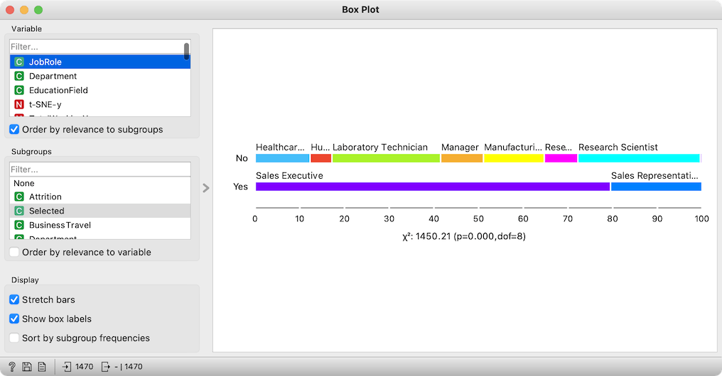
Fine, we are ready now. In the Box Plot, we subgroup the data by the feature Selected, and order the variables by the relevance to the subgroups. The most relevant feature is the position of the data points in the horizontal direction of the t-SNE: we selected the data points from the rightmost cluster. We ignore it, and focus on original data features. At the top is the job role. Very interesting, the cluster we selected contains people that work in sales! That's a great explanation. Also, the Department, the next-ranked feature, tells us that the cluster almost exclusively includes the employees from the Sales Department. These employees were primarily educated marketing, as reported by next-ranked feature EducationField.
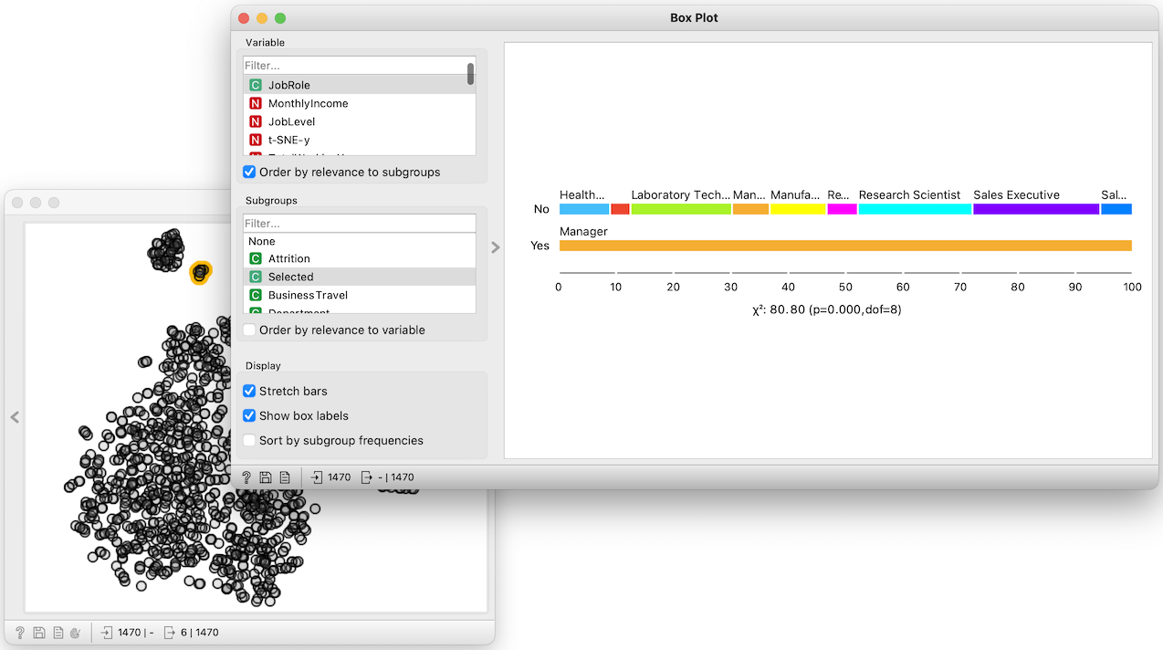
Placing the t-SNE and the Box Plot widget side-by-side, we can now characterize other clusters. The small one on the top contains only managers. And there is a cluster of employees in human resource department, and researcher, and some other managers.
We could also use the Box Plot to report on the differences between two selected clusters. In t-SNE, as in any point-based visualization in Orange, we mark different clusters by selecting points with a shift-modifier. We also need to rewire our workflow to, this time, send only the selected data instances to the box plot. And the subgrouping feature would now need to be the cluster indicator, that is, a feature called Group. But let us leave these details and examples to some other blog.