visualization, violin plot, box plot
Box Plot Alternative: Violin Plot
Ajda Pretnar
Aug 05, 2021
There's nothing more beautiful than seeing your data in plot. Preferably one that exposes interesting properties of the data or relationships between data instances. We recently wrote about embeddings and dimensionality reduction techniques, but now we are back to basics - whisker plots, means, medians, and distributions.
Related: PCA vs. MDS vs. t-SNE
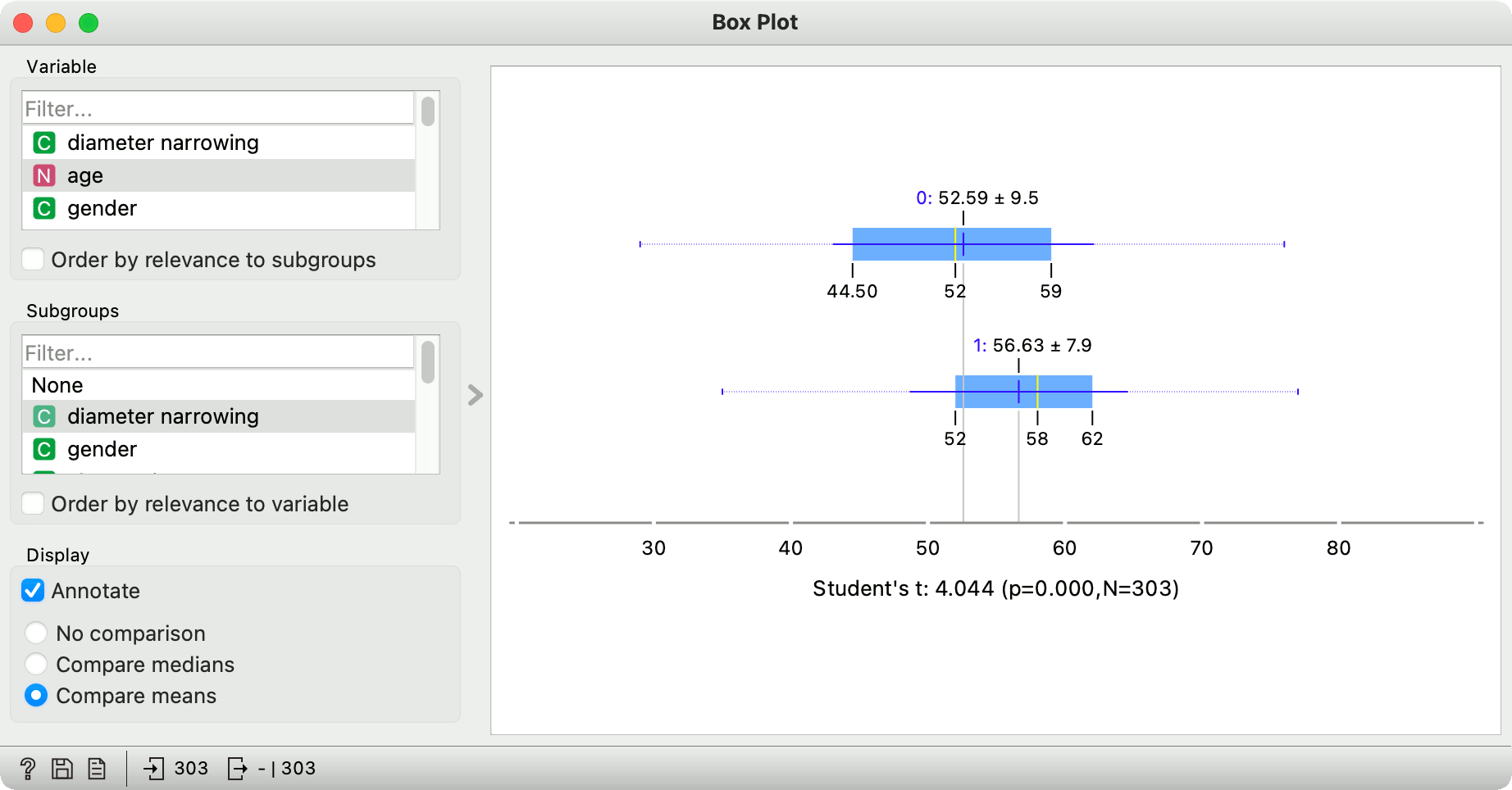
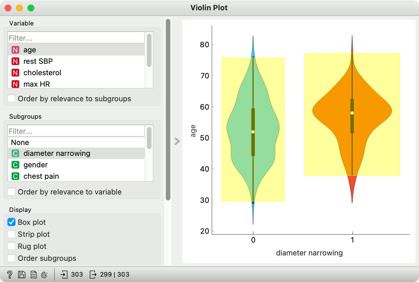
Most of you will be familiar with a good ol' box plot, also called whisker plot. The visualization shows essential data properties - mean, median, interquartile range, and variance. We can expose outliers and data irregularities with a quick glance at the box plot. A great thing about box plot is that is also allows us to split the data by a categorical variable, adding another layer of interpretation.
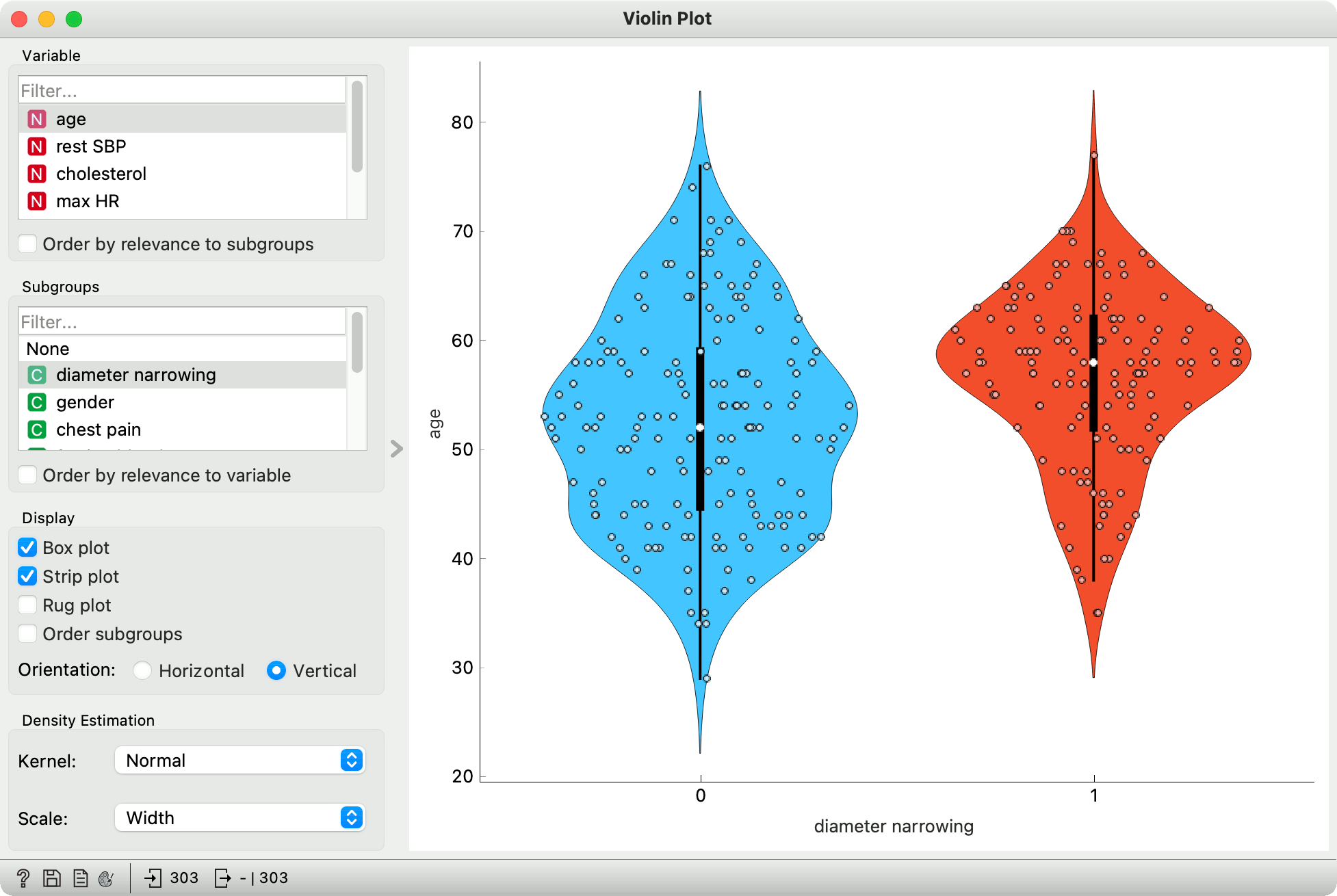
But if box plot is so great, why do we need another visualization? Well, there are some properties of the data that box plot cannot reveal. Enter violin plot, a box plot lookalike with kernel density estimation (KDE).
Violin plot has most of the properties of a box plot. The white dot in the center of the plot represents the median, the thick black stripe the interquartile range, and the thin black line the Tukey's fence*.
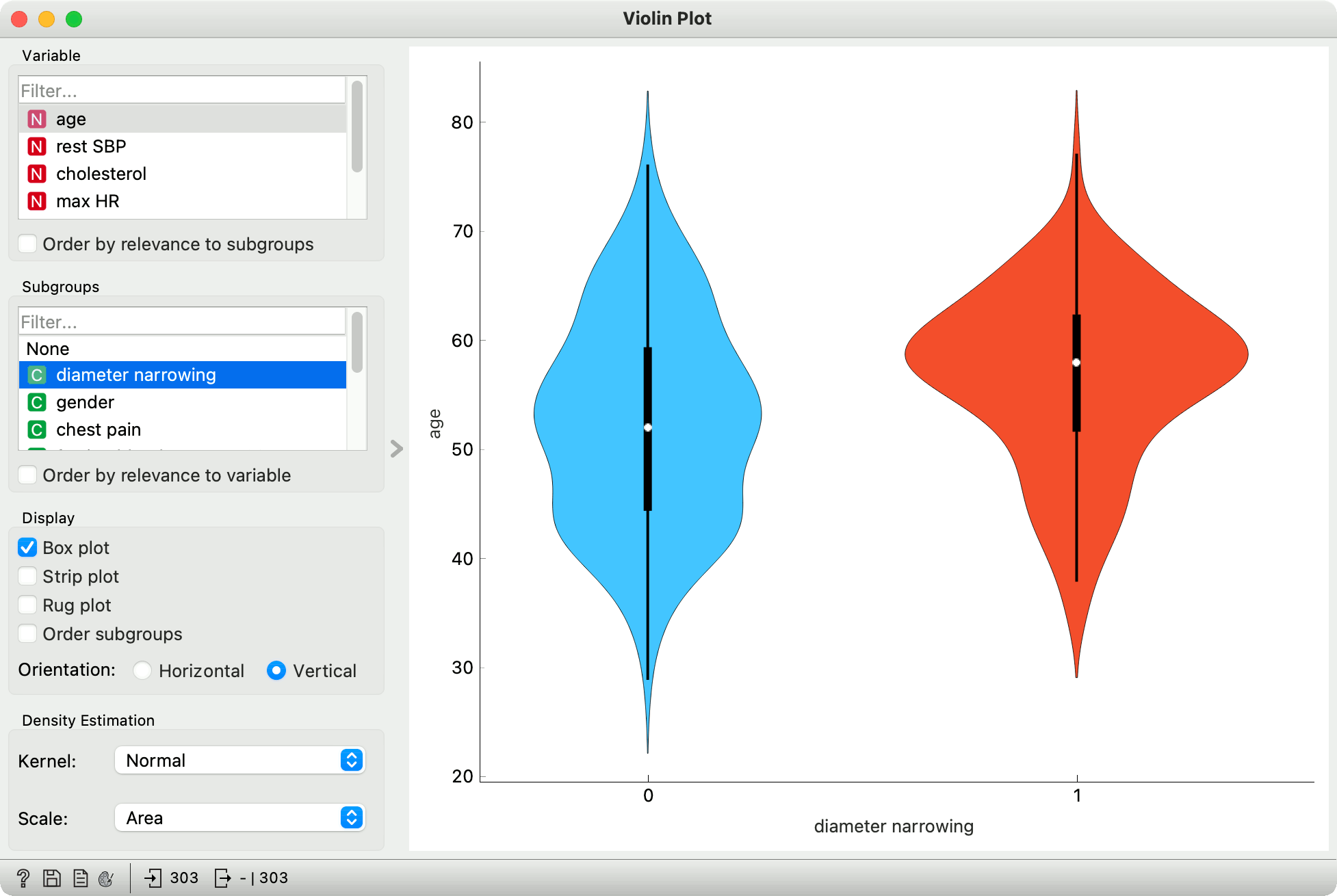
While violin plot doesn't reveal certain aspects of the data, such as the mean and the exact values statistics, it does reveal something very interesting. Violin plot applies a kernel density estimation over data points, which show the likelihood of data points given a normal distribution.
In other words, where the violin is "fatter", there are more data points in the neighborhood. And where it is "thinner", there are less. Violin plots are thus great for exposing underlying distributions, especially if they are multimodal, which cannot be determined from the box plot.
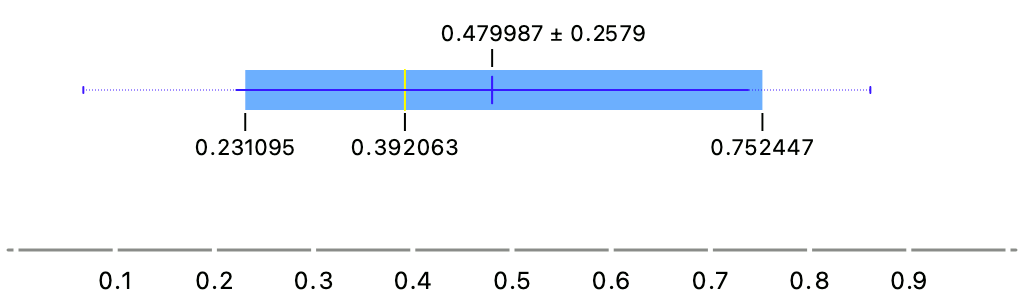
Consider a simple data set we have painted with Paint Data. It clearly has a bimodal distribution, with the first mean around 0.25 and the second one around 0.7.
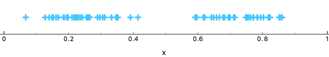
Box plot, however, only shows a single mean, which is around 0.47. It fails to expose the bimodal nature of the data, something that could be very relevant downstream.
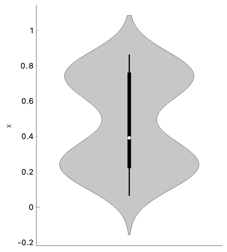
Violin plot to the rescue! The plot nicely shows two "bellies", exposing a bimodal distribution of the data.
One final thing. We have mentioned Tukey's fences, which a simple approach for finding the outliers. Data points that lie outside of the thin black line are considered outliers. We can simply select all the instances that fall inside the line and output them. Thus we have removed the outliers. Keep in mind, though, that these are the outliers only for the specified attribute.
Happy plotting!
* Tukey's fences represent the first and the third quartile with added 1.5 x interquartile range, which defines the outliers, that is the data instances lying outside the defined range.